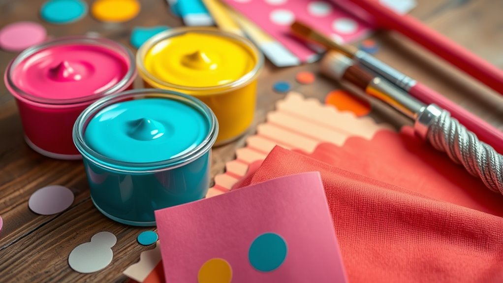

Looking to inspire your next craft project with trendy summer palettes? Bright, bold colors like citrus oranges and lemons, tropical pinks and turquoise, sunset reds and golds, and ocean blues evoke warmth, energy, and relaxation. Add a fresh twist with vibrant fuchsia and lilacs or cool mint and berry hues for balance. Incorporate these shades using techniques like layering or metallic accents to make your designs pop. Explore more ideas to bring these lively colors to life.
Key Takeaways
- Explore vibrant citrus, sunset hues, and berry tones to create energetic, eye-catching summer craft projects.
- Incorporate tropical pinks and turquoise or ocean blues and greens for a refreshing, seaside-inspired color palette.
- Use harmonious pairings like fuchsia and lilac to balance vibrant and calming elements in your crafts.
- Combine mint and berry shades for lively, nature-inspired designs with contrasting cool and warm tones.
- Enhance your crafts with layering, metallic accents, and natural textures to maximize color impact and sophistication.
Vibrant Citrus: Zesty Oranges and Lemons
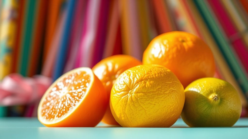
If you’re looking to make a bold statement this summer, vibrant citrus shades like zesty oranges and lemons are the perfect choice. These colors excel in color blocking, creating eye-catching combinations that instantly energize your look. Citrus hues evoke feelings of happiness, enthusiasm, and confidence, thanks to their strong connection to color psychology. Wearing bold orange or lemon yellow signals optimism and radiance, making you stand out effortlessly. Incorporate these shades into your wardrobe or crafts to add a lively, invigorating vibe. Whether you prefer a monochromatic look or contrasting blocks, citrus colors help you express boldness and positivity. Embrace these zesty shades to elevate your summer style and radiate vibrant energy wherever you go.
Tropical Paradise: Juicy Pinks and Turquoise Blues
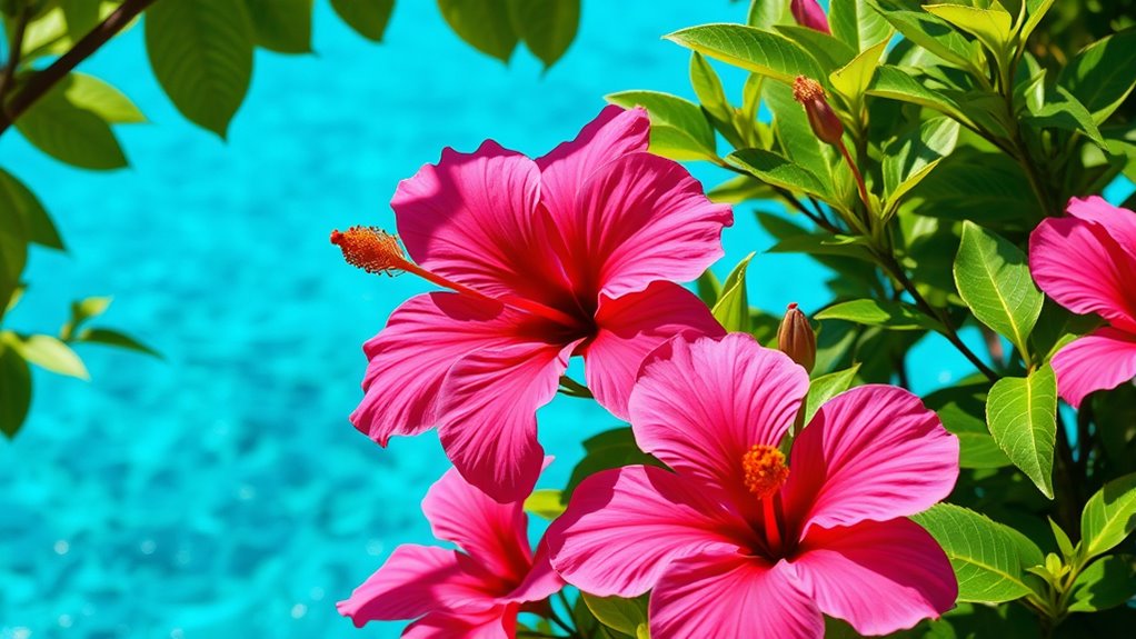
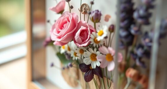
Capturing the essence of a tropical paradise, juicy pinks and turquoise blues evoke the vibrant hues of sun-soaked beaches and clear ocean waters. These lively colors bring energy to your seasonal floral arrangements, making them perfect for summer gatherings. Incorporate these shades into your beachside decor by using colorful cushions, tableware, or woven accents that reflect the lively spirit of the coast. Juicy pinks add a touch of tropical warmth, while turquoise blues create a calming, invigorating vibe. Together, they transform any space into a vibrant oasis, inspiring you to embrace the carefree, sun-drenched atmosphere of a tropical paradise. Utilizing color theory principles can help you create balanced and visually appealing arrangements with these bold shades. Additionally, understanding the trustworthiness of brands can ensure that your craft supplies are of high quality and authentic, making your projects more enjoyable. Recognizing relationship dynamics can also influence how you choose colors to evoke specific moods and connections in your decor. Exploring cultural influences can further enrich your color choices to reflect diverse tropical aesthetics. Incorporating quality craftsmanship can enhance the durability and overall aesthetic of your decor pieces. Whether in craft projects or home decor, this palette invites you to celebrate summer with bold, lively colors.
Sunset Glow: Warm Reds and Golden Yellows

As the sun dips below the horizon, the sky ignites with warm reds and golden yellows, creating a breathtaking sunset glow. This palette embodies the principles of color theory, where warm hues evoke feelings of comfort, energy, and optimism. Incorporating these shades aligns with seasonal color trends that favor vibrant, lively tones perfect for summer crafts. Reds and yellows naturally draw attention and add warmth to any project, making them ideal for statement pieces or subtle accents. You’ll find these colors transforming your work into a radiant display of sunset-inspired beauty. Consider pairing these shades with color harmony techniques for an even more inviting atmosphere. Whether blending reds for depth or layering yellows to brighten, this color palette captures the essence of summer’s fiery, golden hour. Embracing the Law of Attraction can help you manifest confidence and positivity in your creative endeavors. Understanding your emotional response to colors can enhance how you personalize your designs and truly embody the vibrant energy of summer. Exploring natural elements such as sunlight and landscapes can further inspire your color choices and elevate your projects. Feel free to experiment with different shades and textures to personalize your designs and truly embody the vibrant energy of summer.
Cool Ocean Breeze: Deep Blues and Seafoam Greens
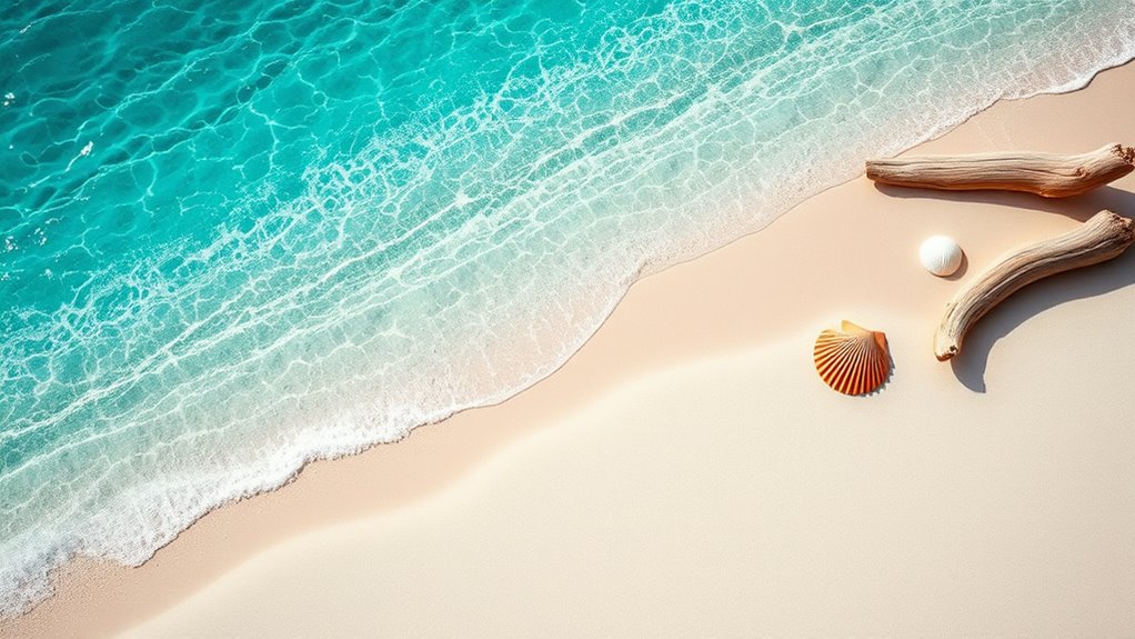
When you think of summer by the ocean, cool ocean breeze colors instantly come to mind. Deep blues evoke the vastness of the sea, while seafoam greens mirror the gentle waves lapping the shore. These shades create a calming, invigorating vibe perfect for beach-inspired decor, bringing a sense of tranquility to any space. Incorporate these hues into your crafts or home accents to evoke seaside serenity. In fashion, seaside accessories like turquoise jewelry or aqua scarves perfectly complement these colors, giving your look a breezy, nautical touch. Whether you’re designing a coastal-inspired room or styling your summer wardrobe, these cool ocean palette tones provide versatility and a soothing aesthetic that captures the essence of oceanfront relaxation. Additionally, understanding color harmony can help you combine these shades effectively for a balanced and appealing design. Exploring color psychology can also enhance how these hues influence mood and ambiance in your creative projects. Incorporating antioxidant-rich hues inspired by the ocean palette can also add a layer of visual wellness to your decor. Recognizing paint sprayer maintenance principles can help ensure your tools remain in top condition for your creative endeavors. The use of these colors in your artwork can further enhance their visual impact and emotional appeal.
Blossom Bright: Fuchsia and Bright Lilacs
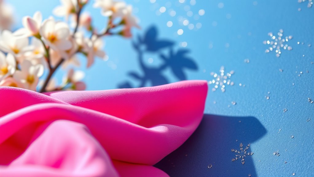
Fuchsia’s bold vibrancy makes it perfect for striking color combinations that stand out. Meanwhile, bright lilacs offer a calming touch, balancing energetic shades with their soothing effects. You can get creative with these hues by exploring fun crafting ideas or adding them to your summer wardrobe for an eye-catching pop.
Vibrant Fuchsia Combinations
Vibrant fuchsia paired with bright lilacs creates an eye-catching color combo that instantly energizes any summer look. This bold pairing commands attention and adds a playful, modern touch to your decor and wardrobe. Incorporate fuchsia wall decor to create a lively focal point in your living space, or accessorize with fuchsia fashion accessories like jewelry or handbags for a pop of color. To elevate your style further, consider these sophisticated pairings:
- Mixing fuchsia with metallic accents for a luxe vibe
- Adding soft neutrals to balance the intensity of the colors
- Using geometric patterns that highlight the vibrant palette
This combination is perfect for making a statement, whether in home design or fashion. Embrace the vivid energy of fuchsia and bright lilacs to keep your summer look fresh and inspiring.
Lilac’s Soothing Effects
Bright lilacs offer a calming counterpoint to the energetic intensity of fuchsia, creating a balanced and harmonious color palette. This shade of purple is often used in flower therapy, as it’s known for its soothing effects on the mind and body. When you incorporate lilac into your crafts, you invite a sense of tranquility and relaxation, helping to ease stress and promote mental clarity. Its gentle hue acts as a visual balm, softening the boldness of fuchsia and grounding the overall design. Using lilac in your summer projects can transform lively palettes into calming, inviting spaces. Whether you’re creating home decor or wearable art, this color’s calming effects make it a perfect choice for adding serenity to vibrant summer styles.
Creative Crafting Ideas
When you combine fuchsia and bright lilacs in your crafts, you create eye-catching projects that balance energy with serenity. These vibrant hues are perfect for elevating your DIY home decor or seasonal fashion accessories. You can craft bold wall art, such as floral canvas prints, or assemble colorful throw pillows that instantly brighten any space. For accessories, consider designing statement jewelry or floral headbands that showcase the lively palette. To add sophistication, incorporate textured materials like embroidered fabrics or metallic accents.
- Create a striking centerpiece using painted vases or candleholders in fuchsia and lilac shades
- Design layered jewelry pieces with contrasting beads and charms for a colorful pop
- Sew or crochet vibrant, patterned scarves or wraps that complement your seasonal wardrobe
Fresh Mint and Berry Hues
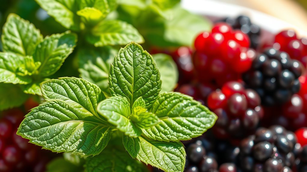
Fresh mint and berry hues create a lively, invigorating vibe perfect for summer projects. These bold color pairings add energy and brightness to any design or decor. Try combining them in your next DIY to make a vibrant statement. Incorporating color schemes inspired by nature can further enhance your creative projects and bring a cohesive look to your space. Additionally, exploring the family dynamics of iconic figures can inspire a deeper appreciation for personal style and expression. Embracing color psychology can also help you select hues that evoke specific moods and complement your overall design theme. Staying informed about trending palettes can ensure your projects remain fresh and relevant throughout the season. Engaging with inspirational quotes about change and growth can motivate you to experiment with bold colors and innovative ideas in your craft endeavors.
Refreshing Color Pairings
If you’re looking to create a lively summer look, pairing fresh mint with berry hues instantly adds a touch of vibrancy. This invigorating color combination leverages dyeing techniques that enhance the contrast and depth of each shade. Understanding color psychology, mint promotes calmness and renewal, while berry tones evoke energy and passion, creating a balanced yet dynamic visual. To elevate your craft, consider:
- Using gradient dyeing techniques for seamless transitions between mint and berry shades
- Incorporating metallic accents to add sophistication
- Playing with layering to deepen the contrast and richness of each hue
These pairings not only energize your projects but also communicate freshness and vitality, perfect for summer-inspired creations.
Perfect for Summer Projects
Summer projects come alive with the vibrant combination of fresh mint and berry hues, making them perfect for adding a lively touch to your creations. These colors tap into color psychology by evoking freshness, energy, and a sense of joy, ideal for the season. They align with seasonal color trends that favor bright, cheerful palettes to celebrate summer’s vibrancy. Whether you’re crafting home decor, fashion accessories, or DIY gifts, these hues instantly uplift your designs. The coolness of mint balances the boldness of berry shades, creating a dynamic, eye-catching contrast. Incorporating these colors helps your projects feel current and seasonally appropriate, inspiring a fresh, energetic vibe that resonates with summer’s lively spirit.
Frequently Asked Questions
How Do These Palettes Suit Different Craft Types?
You’ll find that these palettes suit various craft types by inspiring creative color mixing and enhancing your project’s mood through color psychology. Bright, summery shades energize jewelry or textiles, while softer tones work well for home decor or scrapbooking. By understanding how colors influence feelings, you can choose palettes that resonate with your craft’s purpose, making your creations more vibrant and emotionally impactful.
Are These Color Trends Suitable for Outdoor Projects?
You’ll find that these color trends, especially nature-inspired hues, are perfect for outdoor projects, blending seamlessly with natural surroundings. Monochrome palettes add a sophisticated touch while maintaining harmony with the environment. They’re durable and vibrant enough to withstand the elements, making them ideal for garden decor, outdoor furniture, or art. So, yes, these trendy palettes enhance outdoor crafts by creating a fresh, cohesive look that complements any outdoor space.
What Materials Work Best With These Color Combinations?
Sure, because nothing screams “I’m ready for summer” like painting with candy-colored hues, right? When choosing materials, lean into natural woods, ceramics, or fabric to showcase those bold color pairings. Use color psychology to evoke energy or calm, and remember, contrast is your best friend. Follow color pairing tips to keep your project vibrant and cohesive. After all, your materials should scream “fun,” not “fading away.”
Can These Palettes Inspire Interior Decorating Ideas?
You can definitely use these palettes to inspire interior decorating ideas. Consider color psychology to evoke feelings like calm or energy, and explore cultural symbolism to add meaningful accents. Mix bold shades with neutral tones for balance, and let the vibrant colors set the mood of each space. By understanding these elements, you’ll create a personalized environment that’s both stylish and psychologically impactful, making your home truly reflect your personality.
How Do Color Trends Vary Across Different Seasons?
Imagine your wardrobe shifting with the seasons, just like color trends do. Seasonal color psychology influences these changes, making certain hues more popular at specific times. For example, vibrant summer palettes give way to earth tones in fall. While some colors have short-lived trend longevity, others, like classic blues, stay timeless. You notice how these shifts impact your choices, keeping your style fresh and aligned with seasonal moods.
Conclusion
No matter which summer palette you choose, you’re about to create masterpieces that could make the sun itself jealous. These vibrant colors are your secret weapon to craft projects bursting with energy and joy. So plunge into these trends, let your creativity run wild, and turn your ideas into show-stopping works of art. Remember, with these palettes, your crafts will shine brighter than the hottest summer day—brace yourself for compliments that’ll flood in like a tidal wave!