
To build a signature color style for your handmade work, start by understanding how colors reflect your brand’s personality and evoke emotions. Choose a core palette that aligns with your target audience and the mood you want to convey, ensuring consistency across all platforms. Incorporate eco-friendly and harmonious choices to reinforce your values. Experiment with sample pieces and seek feedback to refine your color choices. Keeping these elements in mind will help you create a memorable and cohesive visual identity. Keep exploring to learn more.
Key Takeaways
- Identify a color palette that reflects your brand personality and evokes the desired emotional response.
- Maintain consistent use of signature colors across all products, packaging, and marketing materials.
- Incorporate color psychology to choose hues that communicate your work’s mood and story effectively.
- Use sustainable and harmonious color choices inspired by eco-friendly principles and nature.
- Test your color palette with samples and gather feedback to ensure it resonates with your target audience.
Creating a signature color style for your handmade work can truly set you apart and make your creations instantly recognizable. When you choose a specific color palette, you’re not just decorating your items—you’re communicating a mood, a personality, and a story that resonates with your audience. To do this effectively, you need to understand color psychology, which is the study of how colors influence emotions and perceptions. For example, bright reds can evoke excitement and energy, while soft pastels might convey calmness and delicacy. By selecting colors that align with your brand message, you help your customers immediately connect with your work, making it more memorable.
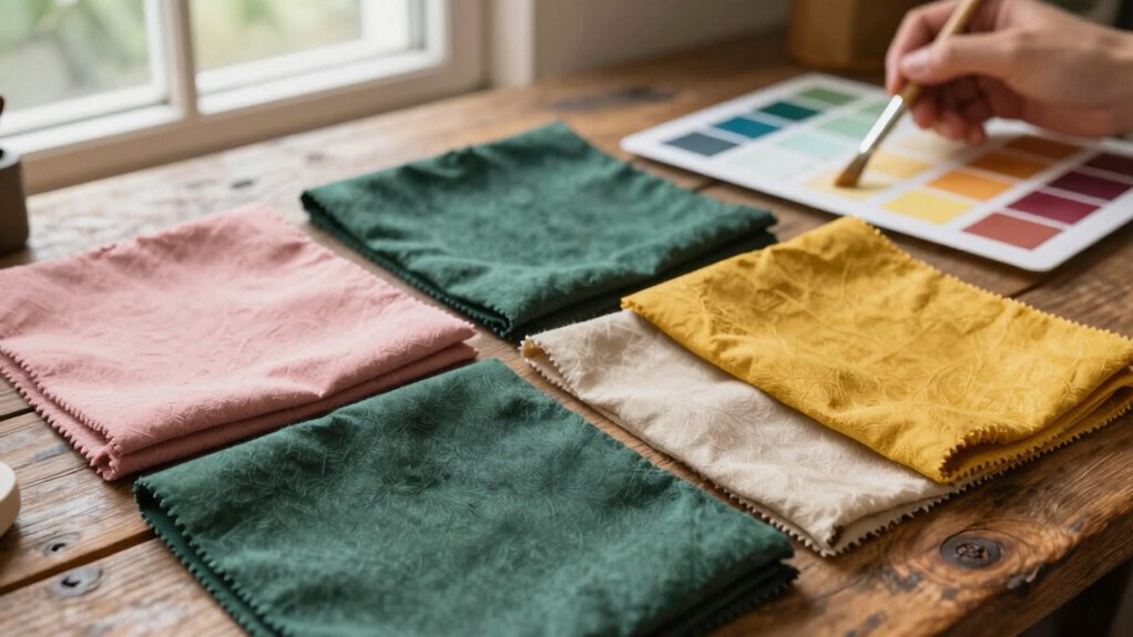
Consistency in your color choices is essential. When your branding remains uniform across all your handmade products, packaging, and online presence, it reinforces your identity. This branding consistency builds trust and recognition over time. When someone encounters your work, the color scheme should instantly remind them of your style. If your signature colors are consistently incorporated into labels, business cards, social media posts, and product photos, your audience begins to associate that particular palette with your craftsmanship and unique aesthetic. This not only creates a cohesive look but also strengthens your brand’s visual identity. Additionally, understanding biodiversity and the importance of sustainable choices can inspire you to select eco-friendly dyes and materials that reflect your values and connect your brand to a broader story of conservation and mindful living. Incorporating color harmony principles can further enhance the visual appeal of your work, creating a balanced and attractive aesthetic.
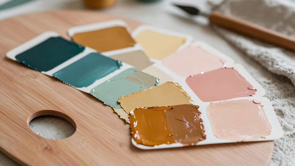
Think about your target audience and the kind of emotional response you want to evoke. Are you aiming for a playful vibe, a sense of elegance, or a natural, earthy feel? Your choice of colors should mirror these intentions. Once you identify your core palette, stick with it. Use the same shades across your entire product line and marketing materials. Even subtle variations should stay within the same color family to maintain unity. If you’re unsure which colors work best, experiment with small samples first. Observe how different shades make you feel and consider seeking feedback from trusted friends or potential customers.
eco-friendly fabric dyes for handmade crafts
As an affiliate, we earn on qualifying purchases.
As an affiliate, we earn on qualifying purchases.
Frequently Asked Questions
How Many Colors Should I Include in My Signature Palette?
You should include 3 to 5 colors in your signature palette, balancing variety and cohesion. Too many colors can overwhelm, while too few might limit your expression. Use color psychology to choose hues that evoke the right emotions, and guarantee they work in harmony for a consistent style. This approach helps create a memorable, authentic brand that resonates with your audience and reflects your handmade work’s unique personality.
Can My Signature Color Style Evolve Over Time?
Yes, your signature color style can evolve over time. As you explore color psychology and seasonal color analysis, you might find new shades that better reflect your personal growth or artistic direction. Your palette should adapt naturally, allowing your work to stay fresh and authentic. Embrace changes, experiment with different hues, and let your evolving understanding of color influence your signature style, making your handmade work more compelling.
What Tools Can Help Me Identify My Ideal Colors?
You can identify your ideal colors using tools like a color wheel, which helps you explore complementary and harmonious shades, and color psychology, guiding you to choose colors that evoke specific emotions. Play with digital color palette generators or apps to experiment easily. By understanding how colors influence perception and mood, you’ll find the perfect palette that reflects your style and resonates with your audience.
How Do I Ensure My Colors Look Good Across Different Materials?
To guarantee your colors look good across different materials, focus on color harmony and material compatibility. Test your chosen colors on various surfaces like fabric, wood, or metal to see how they interact with each material’s texture and finish. Adjust shades if needed, and consider using neutral or versatile hues as a base. This approach helps your colors stay consistent and visually appealing, no matter the material.
Should My Signature Colors Match My Personal Brand or Style?
Absolutely, your signature colors should scream your personal brand or style louder than a megaphone! Think of color psychology as your secret weapon—each hue evokes emotions that align with your brand’s vibe. You want brand consistency to shine through, so your colors become instantly recognizable. When your signature colors mirror your personality, your work becomes unforgettable, creating a powerful visual identity that sticks in everyone’s mind.
color palette selection tools for artisans
As an affiliate, we earn on qualifying purchases.
As an affiliate, we earn on qualifying purchases.
Conclusion
Just like a master painter leaves a signature stroke, your chosen color palette becomes your artistic signature. When you confidently showcase your signature colors, your work becomes instantly recognizable—like a favorite song or a beloved book. Keep experimenting, stay true to your style, and soon your handmade creations will echo your unique identity, much like a melody that lingers long after the first note. Embrace your colors, and let your work tell your story.
sustainable textile dyes
As an affiliate, we earn on qualifying purchases.
As an affiliate, we earn on qualifying purchases.
color psychology art supplies
As an affiliate, we earn on qualifying purchases.
As an affiliate, we earn on qualifying purchases.