
Mastering color theory helps you create harmonious and impactful crafts by understanding the color wheel, color schemes, and their emotional meanings. You’ll learn how primary, secondary, and tertiary colors interact, and how to combine complementary, analogous, and triadic palettes for striking results. Knowing how colors influence mood and cultural perceptions allows you to craft projects with purpose. Keep exploring, and you’ll discover how to apply these principles effectively across various mediums for stunning craft results.
Key Takeaways
- Understand the color wheel and categories to identify and create harmonious color combinations in your projects.
- Use established color schemes like complementary, analogous, and triadic to enhance visual appeal.
- Recognize how colors evoke emotions and cultural meanings to communicate the desired mood effectively.
- Practice mixing, matching, and balancing colors, incorporating neutrals and textures for visual interest and harmony.
- Adapt color choices and techniques to specific crafting mediums, considering materials, lighting, and digital displays.
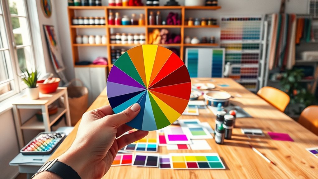
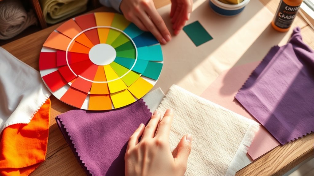
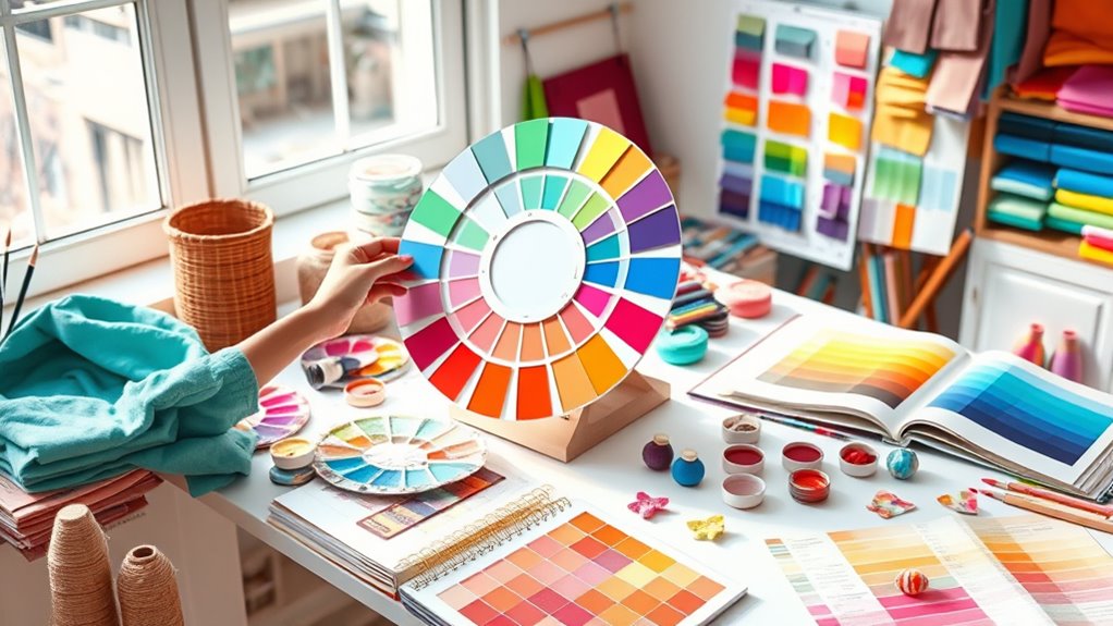
Understanding the Color Wheel
Have you ever wondered how artists choose colors that look great together? The answer lies in the color wheel, which has a rich history dating back to the 17th century, evolving through the work of artists and scientists. Understanding the color wheel construction helps you grasp how colors relate to each other, making your craft projects more harmonious. It’s typically a circular diagram that organizes hues based on their relationships, like complementary or analogous colors. By studying the color wheel, you learn how colors interact and how to create balanced, eye-catching designs. This foundational tool is essential for any crafter aiming to improve color choices and achieve professional-looking results. Knowing the color wheel’s history and construction facilitate a world of creative possibilities, especially when considering color relationships and how they influence visual harmony. Additionally, awareness of spiritual symbolism associated with colors can deepen the emotional impact of your creations. Exploring how different colors are used in regional cultures can also inspire more meaningful and culturally rich designs. Moreover, understanding color theory can enhance your ability to create visually striking and emotionally resonant projects.
Primary, Secondary, and Tertiary Colors
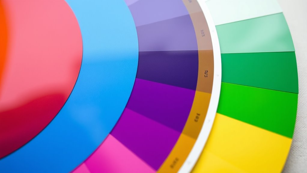
The color wheel organizes hues into specific categories that form the foundation of color theory. You’ll find three main types: primary, secondary, and tertiary colors. Primary colors—red, blue, and yellow—are the basic hues that can’t be created through color mixing. Secondary colors—green, orange, and purple—are made by mixing two primary colors. Tertiary colors result from blending a primary and a secondary color, like yellow-orange or blue-green. Understanding these categories helps with color identification and guarantees your projects have the right color harmony. When you mix colors, knowing which are primary, secondary, or tertiary guides you toward predictable results. Mastering these distinctions makes it easier to create vibrant, balanced color combinations with confidence. Additionally, incorporating color relationships such as complementary or analogous schemes enhances the visual impact of your designs. Recognizing the color temperature of each hue can also influence the mood and atmosphere of your work.
Color Schemes and Harmonies
Understanding different color schemes helps you create visually appealing projects. Complementary pairs add contrast, while analogous blends offer harmony. Triadic combinations bring balance with vibrant, dynamic color arrangements. When combining paints, consider the type of finish and application method to achieve the best results. Adjusting spray settings can enhance the quality of your project by ensuring smooth and even coverage. Additionally, selecting colors with appropriate emotional impact can influence the overall mood and effectiveness of your design. Incorporating mindful color symbolism can deepen the emotional resonance of your craft and foster a more meaningful connection with your audience. Being aware of cultural influences on color choices can help you create designs that are respectful and contextually appropriate, especially when working on projects with diverse themes or audiences. Utilizing wall organization systems with aesthetic hooks and materials like wood or metal can also help you experiment with color placement and contrast in your craft space.
Complementary Color Pairs
Complementary color pairs are a powerful tool for crafters because they create striking visual contrast and balance when used effectively. By understanding pairing techniques, you can make your projects pop and draw attention. When selecting complementary colors, think about how they enhance each other’s vibrancy and harmony. Proper color pairing can elevate your designs, making them more dynamic and eye-catching. To help visualize, consider these points:
- Bright red paired with fresh green for a lively holiday vibe
- Deep blue combined with warm orange for a bold statement piece
- Soft purple with yellow for a cheerful, energetic look
- Rich burgundy and mint for a sophisticated contrast
- Bright pink and lime green for playful, modern crafts
Mastering these techniques ensures your color pairing stands out while maintaining visual harmony.
Analogous Scheme Blends
Building on the bold contrasts of complementary colors, experimenting with analogous schemes offers a softer, more harmonious approach to color pairing. These schemes use colors adjacent on the color wheel, making your color blending smoother and more natural. When you choose an analogous palette, you create a unified look that’s easy on the eyes and enhances overall palette harmony. This method is perfect for projects where you want subtle transitions and a calming effect. To achieve the best results, select one dominant color and incorporate supporting shades that share similar hues. By focusing on palette harmony, you guarantee your craft piece feels cohesive and visually pleasing. Analogous schemes are versatile and simple, making them a great choice for beginners and experienced crafters alike.
Triadic Color Balance
Triadic color schemes create a vibrant yet balanced look by using three hues evenly spaced around the color wheel. This approach offers bold color harmony while maintaining visual harmony. When you use a triadic palette, you achieve striking contrast without clashing, making your projects stand out. To master this, focus on palette coordination, balancing the intensity of each color to prevent overwhelm.
Imagine a lively craft piece featuring a rich blue, vibrant red, and sunny yellow—each color complementing the other. Think of a design where each hue plays a distinct role but works harmoniously. Use this scheme for lively, energetic projects that need a balanced pop of color. Proper palette coordination guarantees your colors work together seamlessly, resulting in a cohesive and eye-catching finished product.
- Bright, bold visuals
- Dynamic contrast
- Balanced color distribution
- Versatile for various crafts
- Eye-catching, lively designs
The Psychology of Colors
Colors can influence how you feel and how others perceive your crafts. You might notice that different cultures assign unique meanings to certain hues, impacting your message. Understanding the emotional and cultural effects of colors helps you create pieces that evoke the right mood and response. Additionally, being aware of bias in AI outputs can inspire you to thoughtfully select color combinations that resonate authentically with diverse audiences. Recognizing the psychological impact of colors allows you to craft designs that support specific emotional responses, making your work more impactful. Considering cultural associations with colors can further refine your choices to ensure your crafts communicate the intended message across different audiences. Exploring regional influences, like those found in local culinary experiences, can also inspire color choices that reflect regional identity and tradition. Furthermore, understanding color symbolism in various contexts can help you craft more meaningful and culturally sensitive designs.
Colors and Emotions
Have you ever noticed how certain shades make you feel instantly energized or surprisingly calm? That’s the power of color symbolism and emotional responses. Colors evoke feelings without words, influencing your mood and actions. For example, red can spark excitement and passion, while blue often promotes relaxation and trust. Green might bring a sense of balance and renewal, and yellow can energize your creativity. Black evokes sophistication or mystery, and white suggests purity and simplicity. Understanding these associations helps you choose colors intentionally in your crafts to communicate emotions or set a mood. By harnessing the psychology of colors, you can elevate your projects and connect more deeply with your audience through visual storytelling.
Cultural Color Meanings
While understanding individual emotions evoked by colors is important, it’s equally essential to recognize how cultural contexts shape their meanings. Cultural symbolism influences how colors are perceived worldwide, often rooted in historical significance. For example, red can symbolize luck in China but danger in Western cultures. Awareness of these differences helps tailor your crafts to diverse audiences. Here’s a quick overview:
| Color | Cultural Symbolism | Historical Significance |
|---|---|---|
| Red | Passion, celebration | Victory, revolution |
| White | Purity, peace | Mourning, death |
| Black | Elegance, power | Authority, mystery |
| Yellow | Happiness, caution | Wealth, imperial power |
Understanding these nuances ensures your creations respect cultural meanings and resonate authentically.
Color Impact on Mood
Understanding how colors influence mood can dramatically enhance your crafting choices, as each hue elicits specific emotional responses. Color symbolism plays a key role in shaping how your projects are perceived and the mood they create. Warm colors like red and orange can energize and evoke excitement, perfect for lively decorations. Cool tones such as blue and green promote calmness and relaxation, ideal for soothing spaces. Bright shades boost positivity and optimism, while muted tones foster sophistication and tranquility. Recognizing these effects helps you use color intentionally for mood enhancement, making your crafts more impactful. Visualize a vibrant red centerpiece sparking enthusiasm or soft pastels creating a peaceful ambiance. By understanding the psychology of colors, you craft with purpose, influencing emotions and elevating your creative expression.
How to Mix and Match Colors
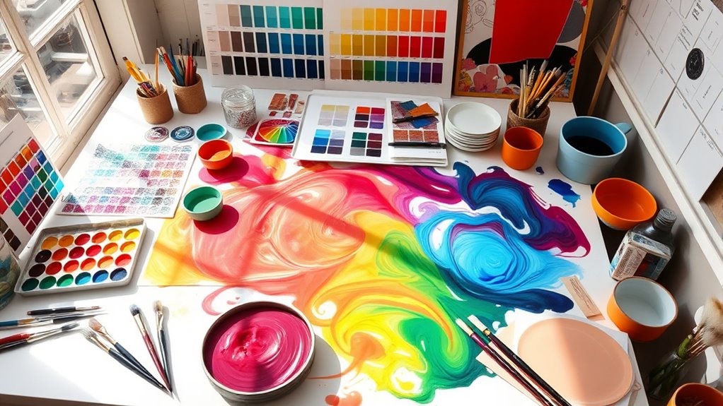
Mixing and matching colors effectively can transform your craft projects from ordinary to eye-catching. To do this, focus on color blending, which involves smoothly combining hues to create harmony and depth. Practice layering colors strategically—start with a base shade and add accents or highlights to enhance contrast and interest. Pay attention to color relationships; pairing complementary or analogous colors can make your designs pop. Use color layering to add dimension, building up shades gradually for richer effects. Remember, balance is key—too many contrasting colors can overwhelm, while careful blending and matching create a cohesive look. Incorporating color psychology can also influence how viewers perceive your designs and evoke specific emotions. Additionally, exploring various crochet styles for locs can inspire unique color combinations that complement your chosen palette. Understanding celebrity transformations can provide creative ideas for bold and innovative color choices in your projects. When selecting colors for hybrid bicycles, considering versatility and how different hues perform on various terrains can help inform your palette choices. Experiment with different combinations, trust your eye, and don’t be afraid to test new pairings to discover what works best for your projects.
Using Neutrals to Balance Your Palette
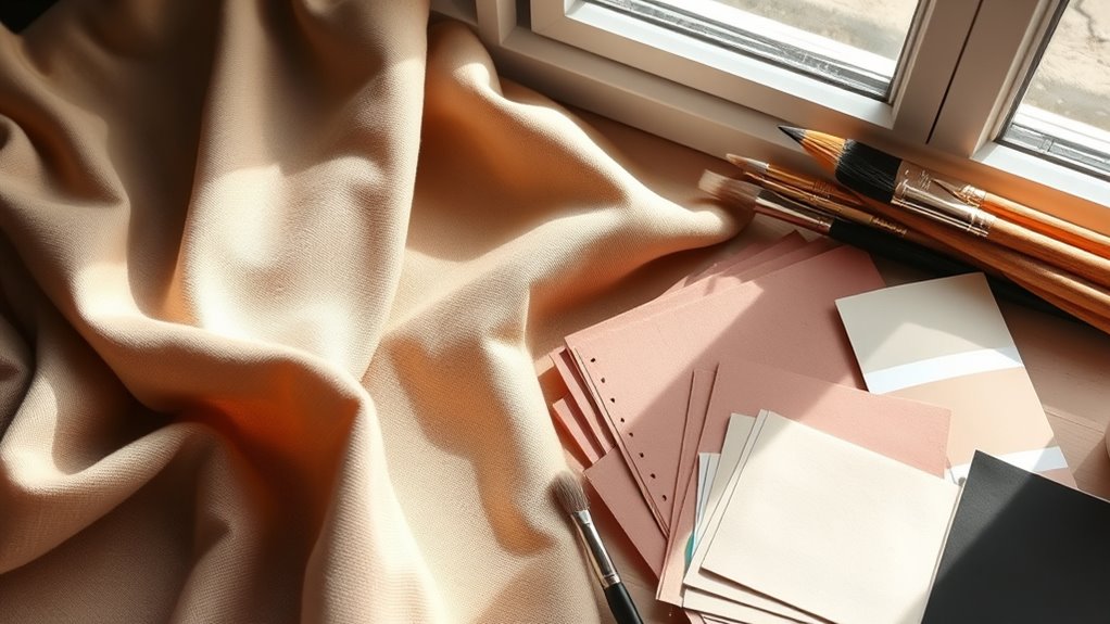
Neutrals like beige, gray, and white act as anchors in your color palette, giving your projects a sense of stability. They help balance out bright and bold hues, preventing your design from feeling overwhelming. By thoughtfully incorporating neutrals, you create a harmonious look that highlights your favorite colors.
Neutral Shades as Anchors
Neutral shades serve as essential anchors in your color palette, providing balance and stability amid brighter or bolder hues. They help create harmonious color combinations and prevent your design from feeling overwhelming. By incorporating neutrals, you can highlight specific colors and establish a calm foundation for your projects.
Imagine a soft beige background making vibrant reds pop, or a cool gray grounding warm earth tones. Neutral shades act as versatile tools to enhance color harmonies, making your overall palette more cohesive. They also allow you to experiment with bold colors without losing visual harmony.
- Soft beige, taupe, or ivory backgrounds
- Warm grays balancing earthy tones
- Charcoal or black for contrast
- Creamy whites for subtle highlights
- Light browns to unify warm hues
Balancing Bright and Bold
When incorporating bright and bold colors into your designs, balancing them with neutral shades is essential to prevent overwhelming the viewer. Neutrals help control color saturation and temper the intense energy of vivid hues. Consider how warm neutrals like beige or taupe contrast with cool, saturated blues or greens. Using neutrals as a backdrop allows your bold colors to stand out without clashing. Visualize this:
| Neutral Base | Bright Accent | Effect |
|---|---|---|
| Soft Gray | Vibrant Red | Creates excitement without chaos |
| Cream | Electric Blue | Adds calmness and focus |
| Warm Taupe | Bright Yellow | Balances energy and warmth |
| Charcoal | Neon Green | Grounds boldness, enhances contrast |
| Beige | Hot Pink | Keeps playful vibrancy steady |
This balance optimizes color temperature and saturation, making your designs both lively and harmonious.
Creating Visual Interest With Contrasts

Creating visual interest with contrasts is a powerful way to make your craft projects stand out. By using color contrast thoughtfully, you can create a clear visual hierarchy that guides the viewer’s eye. High contrast between light and dark colors creates emphasis, while complementary colors add vibrancy and excitement. Contrast in saturation and hue also brings depth, making certain elements pop. Consider pairing bold colors with muted tones to balance your design. These contrasts can evoke different moods and draw attention to focal points. When applied skillfully, contrasts not only enhance aesthetics but also improve overall clarity and engagement in your craft. Use these techniques to craft visually compelling projects that command attention and showcase your creative talent.
- Bold colors against soft backgrounds
- Light and dark shades for depth
- Complementary color pairings
- Saturation differences for emphasis
- Contrasting textures and finishes
Applying Color Theory to Different Crafting Mediums

Applying color theory effectively requires tailoring your approach to each crafting medium, as different materials respond uniquely to color choices. For example, when working with paints, understanding color mixing helps you create the desired shades and tones, influencing how colors blend on your palette and surface. In fiber crafts like knitting or weaving, color perception can vary based on fiber type and lighting, affecting how colors appear in the finished piece. Digital crafts, such as graphic design or digital illustration, demand attention to screen color calibration and how colors display across devices. Each medium interacts differently with color, so knowing how to adapt your color choices enhances your craft’s visual impact. Recognizing these nuances ensures your use of color is both intentional and effective across various crafting mediums.
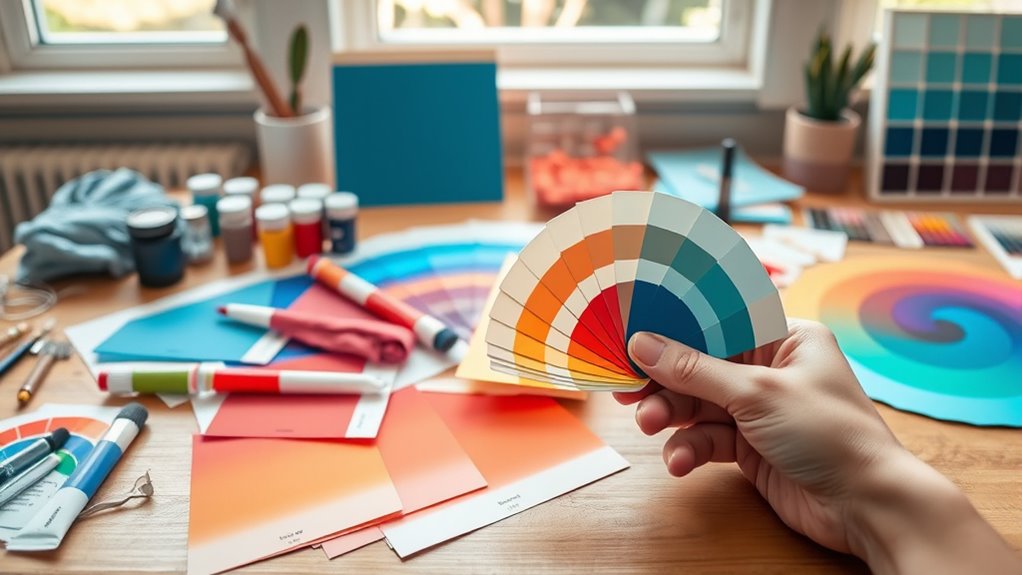
Tips for Selecting Colors for Your Projects

Choosing the right colors is essential to making your project stand out and convey the desired mood. To do this effectively, consider color harmony to create visually pleasing combinations. Pay attention to color saturation; vibrant colors evoke energy, while muted tones bring calmness. Here are some tips to guide your choices:
- Use complementary colors for striking contrast.
- Balance saturated and desaturated colors for harmony.
- Stick to a limited palette to keep cohesion.
- Think about the mood you want to evoke—bright for lively, soft for soothing.
- Test color combinations before committing to your final project.
Practice Exercises to Improve Your Color Skills
To strengthen your color skills, practicing regularly with targeted exercises can make a noticeable difference. Start by experimenting with color mixing—combine primary colors to create secondary and tertiary hues, then observe how they interact. This sharpens your understanding of color relationships and helps you predict outcomes. Next, focus on palette planning: choose a limited set of colors and create several mini projects, such as swatches or small crafts, to see how well they harmonize. Challenge yourself to adjust the shades, tones, and contrasts within your palette. Repeating these exercises builds confidence and improves your ability to select and combine colors instinctively. Consistent practice makes color mixing and palette planning second nature, elevating your craft projects with vibrant, cohesive color schemes.
Frequently Asked Questions
How Do Lighting Conditions Affect Color Perception in Crafting?
Lighting conditions substantially influence how you perceive colors in your crafts. Poor or uneven lighting can create lighting illusions, causing perception shifts where colors look different than in natural light. Bright, natural light reveals true colors, while artificial or dim lighting can distort them. To guarantee your projects look their best, check your work under various lighting conditions and adjust accordingly, so your colors stay vibrant and true.
Can Color Theory Apply to Digital and Print Craft Projects Effectively?
Color theory is like a universal language, and you can definitely speak it across digital and print projects. You just need to master digital color matching and print color calibration to guarantee your colors stay true. By understanding how colors interact and applying these principles, you can create cohesive, vibrant crafts whether on screen or in print. It’s about translating your vision smoothly across mediums, no matter where your creativity takes you.
Are There Cultural Differences in Color Symbolism for Crafting?
You should consider cultural symbolism and regional preferences because they influence how colors are perceived in crafting. Different cultures assign unique meanings to colors, which can affect your project’s message or appeal. By understanding these differences, you can choose colors more thoughtfully, ensuring your crafts resonate appropriately with diverse audiences. Pay attention to cultural context, and you’ll create more meaningful and respectful projects that connect on a deeper level.
How Do Color Trends Influence Long-Term Project Choices?
Think of color trends as a shifting tide shaping your creative choices. You follow trend forecasting and color psychology to stay afloat, but long-term projects need a steady anchor. While trends can inspire fresh ideas, relying solely on them might date your work. Balance current color influences with your personal style, ensuring your projects remain timeless even as the color landscape evolves.
What Tools or Software Can Assist in Color Planning for Crafters?
You can use tools like Adobe Color, Coolors, and Canva to assist with color planning. These apps help you create cohesive color palettes and guarantee accurate color matching, making your projects more harmonious. They offer features like exploring trending color schemes and experimenting with different combinations. Using such software simplifies choosing the right colors, saving you time and helping you craft visually appealing and well-coordinated projects effortlessly.
Conclusion
Now that you’ve revealed the secrets of color theory, envision your projects as vibrant gardens blooming with harmony and contrast. Each color is a seed, and your choices are sunlight and water, shaping the beauty you create. Trust your instincts, experiment boldly, and watch your craft flourish with depth and life. With every stroke and blend, you’re cultivating a masterpiece that speaks your unique story—an everlasting canvas of color’s magic.