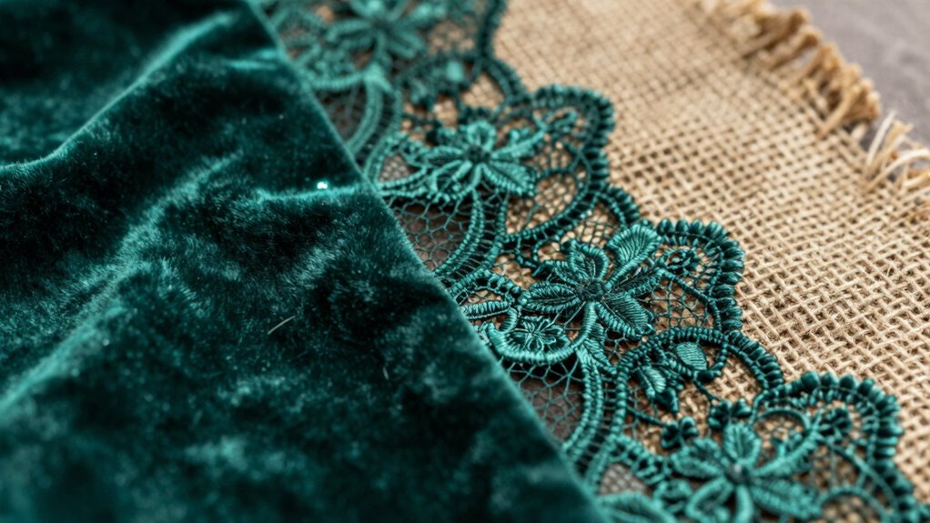

To layer textures without making a space look busy, focus on balancing different textures by mixing smooth and rough surfaces thoughtfully. Keep your color palette cohesive to unify the varied textures. Use larger textures in the background and smaller, intricate ones as focal points to create visual interest without overwhelming. Distribute textures evenly across the space, and step back regularly to assess harmony. If you stay mindful of contrast and simplicity, you’ll craft a layered, inviting environment—keep going to discover more tips.
Key Takeaways
- Limit the number of textures to avoid clutter and maintain visual clarity.
- Use a cohesive color palette to unify varied textures seamlessly.
- Balance bold textures with sleek, simple elements for contrast and calmness.
- Distribute textures evenly across the space to prevent visual overload.
- Regularly step back and assess to ensure harmony, removing excess textures if needed.
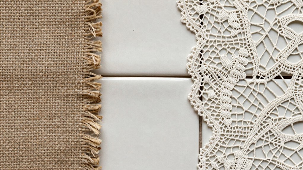
Start by choosing a neutral or harmonious color palette. When textures share a consistent color scheme, they naturally blend, preventing the space from looking too busy. For example, combining shades of beige, taupe, or soft greys allows different textures—like a woven rug, a velvet cushion, or a wooden accent—to complement each other seamlessly. This color harmony acts as a visual anchor, guiding the eye smoothly across the space and preventing the textures from competing for attention.
Next, consider the scale and placement of each texture. You don’t need to fill every inch of a surface with texture; instead, select a few key pieces that serve as focal points. For example, a textured throw blanket on a sofa, a patterned wallpaper on one wall, and a textured vase on a side table can work together without creating visual chaos. Keep larger textures in the background or on less prominent surfaces, and reserve smaller, more intricate textures for focal points. This approach maintains visual balance by distributing interest evenly across the space. Understanding visual balance is essential to avoid overwhelming the viewer. Additionally, paying attention to texture variation helps in creating a layered look that isn’t monotonous. Incorporating texture contrast thoughtfully further enhances the depth and interest of the design. Being mindful of texture scale helps in achieving a balanced and cohesive aesthetic.
Pay attention to contrast—both in texture and tone. Combining smooth and rough textures adds depth, but if you’re not careful, it can feel overwhelming. To avoid this, balance highly textured pieces with sleek, simple elements. For instance, pair a chunky knit pillow with smooth, silk curtains. This contrast enhances visual interest without making the space look busy. Remember, a little contrast goes a long way.
Finally, step back and evaluate your space. Does it feel harmonious or hectic? If it’s the latter, remove or swap out some textures. Sometimes, less is more. Understanding visual balance is key to achieving a cohesive layered look. When you keep your color palette consistent, distribute textures thoughtfully, and maintain visual balance, you’ll create a layered space that feels lively yet calm. This way, your textures add depth and personality without cluttering the aesthetic.
As an affiliate, we earn on qualifying purchases.
Frequently Asked Questions
How Do I Choose Textures That Complement Each Other?
To choose textures that complement each other, focus on creating texture contrast and pattern harmony. Select textures that differ in feel—like smooth against rough—to add visual interest without clutter. Balance busy patterns with more subtle ones to prevent overwhelm. Stick to a cohesive color palette and consider the scale of each texture. This approach guarantees your project remains harmonious, engaging, and well-layered without becoming too busy or chaotic.
What Tools Are Best for Layering Textures Digitally?
You should use digital blending modes in photo editing software like Photoshop or GIMP to layer textures seamlessly. These tools allow you to control how textures interact, creating depth without clutter. Texture masking helps you hide or reveal specific areas, ensuring a balanced look. Experiment with different blending modes and masks to find a harmonious combination that enhances your project without making it look busy.
How Can I Prevent Textures From Overpowering My Design?
Imagine a delicate lace overlay on a sturdy canvas—that’s texture contrast working to your advantage. To prevent textures from overpowering your design, focus on pattern harmony by balancing bold and subtle textures. Use softer, muted textures alongside more vibrant ones, and keep larger textures limited. This approach creates visual interest without overwhelming, ensuring your design remains cohesive and engaging rather than busy or chaotic.
Are There Specific Color Schemes That Work Best With Layered Textures?
You should opt for color schemes that promote color harmony, like analogous or monochromatic palettes, to keep your layered textures cohesive. Neutral tones with subtle pops of color also work well, ensuring visual cohesion without overwhelming the design. Avoid clashing or overly vibrant colors, which can make your project look busy. By choosing harmonious colors, you create a balanced, inviting look that highlights textures without overpowering the overall aesthetic.
How Do I Balance Texture Depth With Overall Project Simplicity?
Sure, because who doesn’t love a chaotic tapestry? To balance texture depth and simplicity, focus on contrasting textures to create visual hierarchy, guiding the eye effortlessly. Limit your textures to a few well-chosen types, and leave plenty of negative space to prevent overload. By doing so, you keep your project engaging without becoming overwhelming, ensuring each element has room to breathe while maintaining an overall clean, cohesive look.
Conclusion
By mastering the art of layering textures thoughtfully, you’ll find that your projects naturally gain depth and interest—almost like the textures themselves are whispering secrets. When you strike the right balance, it’s surprising how a simple combination can transform a busy scene into a harmonious masterpiece. Sometimes, it’s the unintentional overlaps that reveal the most stunning effects, reminding you that in design, as in life, a little coincidence can lead to the most beautiful outcomes.