
To make small craft details pop, use contrast by pairing bold, vibrant colors with muted backgrounds or opposite hues like blue and orange. Incorporate texture differences, such as glossy surfaces against matte ones, to add depth and tactile interest. Arrange your elements using visual hierarchy to focus attention on key details. Mixing textures and colors enhances visual appeal and highlights individual features. Keep experimenting with contrast techniques, and you’ll discover more ways to create eye-catching, professional-looking crafts.
Key Takeaways
- Use bold, vibrant colors against muted backgrounds to make small details pop visually.
- Incorporate contrasting textures, like glossy versus matte, to add depth and tactile interest.
- Pair delicate details with contrasting hues or materials to emphasize their prominence.
- Arrange elements using visual hierarchy principles, highlighting contrast to guide viewer focus.
- Combine color and texture contrasts for maximum visual impact and enhanced detail visibility.
Contrast is a powerful tool that can make your designs, photos, and artworks stand out by emphasizing differences. When you’re working on small craft details, using contrast effectively can transform a simple project into something eye-catching and professional-looking. Two key ways to achieve this are through color pairing and texture variation. These techniques help create visual interest and direct attention exactly where you want it.
Contrast enhances small craft details, making your work eye-catching and professional through color and texture differences.
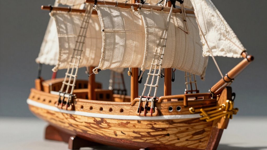
Color pairing is one of the most straightforward methods to introduce contrast. Think about pairing bold, vibrant colors with muted or neutral tones. For example, if your craft features delicate, intricate details, use a bright hue like red or turquoise against a subdued background such as beige or gray. The stark difference in color will naturally draw the eye to those small details, making them pop despite their size. Conversely, you can use contrasting color schemes—like complementary colors on the color wheel, such as blue and orange—to create a vibrant visual impact. This contrast not only highlights specific elements but also adds energy and dynamism to your work. Additionally, understanding how visual hierarchy influences the viewer’s perception can help you arrange these contrasts more effectively. Incorporating color contrast techniques can further enhance the overall appeal of your craft.
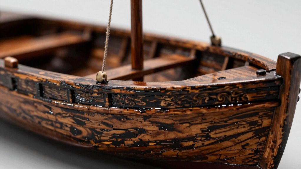
Texture variation is another essential technique. It involves contrasting smooth, glossy surfaces with rough, matte, or textured materials. It can be especially effective because it adds depth and tactile interest. For instance, if you’re working on a miniature sculpture or jewelry piece, pairing a shiny, polished bead with a rough, matte metal accent creates a striking visual contrast that emphasizes each element’s unique qualities. Texture variation helps to guide the viewer’s eye across your craft, making even tiny details noticeable. You can also incorporate different fabric textures in textile crafts or mix materials like wood and metal in mixed-media projects to amplify this effect. Exploring material contrast can open up even more creative possibilities for highlighting small details.
glossy matte craft paint set
As an affiliate, we earn on qualifying purchases.
As an affiliate, we earn on qualifying purchases.
Frequently Asked Questions
What Color Contrasts Work Best for Small Craft Details?
Bright, bold color pairings work best for small craft details, creating strong visual emphasis. Use high-contrast combinations like black and white or vibrant colors like red and yellow to make details pop. You can also try complementary colors, such as blue and orange, for a striking effect. These contrasts draw the eye directly to the details, making your craft stand out. Experiment with different pairings to find what best highlights your unique design.
How Do I Balance Contrast Without Overwhelming the Design?
You can balance contrast by focusing on color harmony, ensuring your contrasting shades complement each other without clashing. Use subtle variations for smaller details, maintaining a clear visual hierarchy where the most important elements stand out, but without overpowering the overall design. Limit high-contrast colors to key areas, and keep the rest more subdued. This approach keeps your craft balanced, engaging, and visually appealing without overwhelming the viewer.
Can Contrast Techniques Be Used on Textured or Patterned Surfaces?
Think of contrast techniques as a storyteller’s voice, bringing textured or patterned surfaces to life. You can definitely use contrast on textured surfaces by emphasizing textural variations—light and shadow accentuate the depth. Pattern enhancement also works by contrasting different motifs or scales, making details pop without overwhelming. This approach adds emotional depth and visual interest, helping your craft feel dynamic and engaging while maintaining harmony within your design.
What Tools Are Best for Applying Contrast in Small Craft Projects?
You should use fine-tipped brushes or detail pens to apply contrast in small craft projects, as they offer precision. Incorporate color theory by choosing contrasting colors—like complementary pairs—to make details pop. Use sponges or stippling tools for textured surfaces, enhancing contrast techniques. Acrylic paints, gel pens, or colored pencils are ideal for controlled application. These tools help you create striking differences that make your craft details stand out effectively.
How Does Lighting Affect the Visibility of Contrast on Small Crafts?
Lighting greatly impacts the visibility of contrast on your small crafts. Ambient lighting influences how colors appear, with warmer lights enhancing reds and yellows, while cooler lights emphasize blues and greens. Understanding color psychology helps you choose lighting that boosts contrast effectively. Proper lighting guarantees your craft’s details stand out, making the contrast more vivid and eye-catching. Adjusting ambient light levels can dramatically improve how your craft’s features are perceived.
color contrast craft supplies
As an affiliate, we earn on qualifying purchases.
As an affiliate, we earn on qualifying purchases.
Conclusion
By mastering contrast, you highlight what matters, draw attention to details, and create depth in your craft. Use contrast to make colors pop, shapes stand out, and textures come alive. Emphasize what’s important, differentiate what’s subtle, and balance your elements for harmony. When you leverage contrast effectively, you not only enhance your craft’s visual appeal but also guide the viewer’s eye effortlessly. In contrast, without it, your work risks looking flat and forgettable.
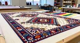
texture contrast craft materials
As an affiliate, we earn on qualifying purchases.
As an affiliate, we earn on qualifying purchases.
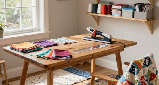
small craft detail highlighting tools
As an affiliate, we earn on qualifying purchases.
As an affiliate, we earn on qualifying purchases.