
TL;DR

Get business pricing on tools and workshop supplies
- Business-only prices and quantity discounts
- Tax-exempt purchasing
- Multiple users, one account, clear invoices
Interior designer Preston Konrad has popularized a fall decor trend that pairs pumpkins with vintage blue and white chinoiserie pottery. This approach replaces traditional autumn motifs with a timeless, upscale aesthetic. Konrad also recommends using silver instead of gold to create visual contrast.
Interior designer Preston Konrad is promoting a fall decor trend that pairs pumpkins with vintage blue and white chinoiserie pottery, moving away from traditional autumn motifs. This styling choice, which Konrad describes as having a ‘Ralph Lauren’ aesthetic, aims to create a look that is timeless rather than seasonal. The approach has gained traction among DIY enthusiasts seeking upscale alternatives to standard holiday decorations.
Konrad, who appears on Freeform’s That Thrifting Show, shared the concept in a recent Instagram video. He suggests that combining orange pumpkins with blue and white china creates a sophisticated visual contrast. According to Konrad, this pairing feels ‘inherently Ralphy’ and evokes a ‘Connecticut or Hamptons’ vibe rather than a typical Thanksgiving theme. He notes that the color combination is ‘a little unexpected, but so classic’, allowing homeowners to integrate existing dishware collections into their seasonal decor.
Beyond pottery, Konrad recommends using silver or chrome serveware instead of the traditional gold or brass tones. He argues that the cool-toned metallics provide greater visual interest when contrasted with the warm orange of the pumpkins. This pairing highlights both the brightness of the silver and the saturation of the gourds. Konrad suggests styling pumpkins in a silver bowl on a sideboard or end table to achieve this effect.
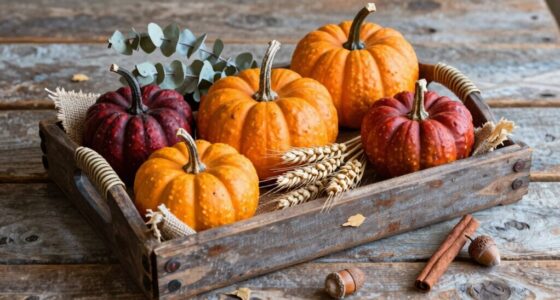
The designer also advocates for tonal pumpkin arrangements and stacking pumpkins in outdoor urns. He describes the urn method as ‘country chic’ with a touch of whimsy, while tonal arrangements on a stoop or table offer variety without appearing overly thematic. Konrad emphasizes that these methods allow for personalization, encouraging decorators to mix in a few orange accents to make the display pop.
Shift Toward Timeless Seasonal Decor
This trend reflects a broader shift in home decor towards year-round usability and timeless aesthetics. By integrating fall items like pumpkins with permanent collections such as china or silver, homeowners avoid the need to store seasonal decor away for months. The approach validates the use of existing blue and white dishware beyond summer, suggesting that seasonal changes can be marked by color contrast rather than thematic replacements. This reduces the visual clutter often associated with traditional holiday decorating and aligns with a preference for understated elegance over overt festivity.
Rise of Thrifted and Vintage Accents
Konrad’s recommendation specifically highlights thrifted or antique blue and white pottery, tapping into the growing popularity of vintage sourcing. This aligns with his role on That Thrifting Show, where secondhand finds are central to design narratives. The trend leverages the complementary nature of orange and blue, a standard color theory principle, to create harmony without requiring new purchases. It builds on the long-standing association of chinoiserie with traditional American and British interiors, recontextualizing it for a modern autumn setting.
“These are some of my favorite ways to style pumpkins that a) don’t look basic, and b) don’t look like everyone else’s.”
— Preston Konrad, interior designer
Durability of the Trend
While the aesthetic is currently popular on social media platforms like Instagram, it is unclear how long this specific chinoiserie-pumpkin pairing will remain a dominant trend. The trend relies heavily on the availability of specific vintage pottery, which may vary by region and thrift store inventory. Additionally, the long-term adoption of silver over gold for fall decor remains to be seen, as gold has traditionally dominated autumn metallics.
Integration into Holiday Styling
Homeowners adopting this trend are expected to apply these principles to Thanksgiving tablescapes and holiday centerpieces. The use of tonal pumpkins and silver accents may extend into winter decor, potentially influencing how holiday greens are styled. Designers may continue to release content showing how to layer these elements, such as combining blue and white with silver for a cohesive look that transitions from early fall through the holiday season.
Key Questions
Why is blue and white pottery paired with pumpkins?
Orange and blue are complementary colors, creating a strong visual contrast. Designers note that this pairing feels timeless and upscale, avoiding the cliché of traditional autumn decor.
What type of pottery is recommended?
The trend specifically highlights chinoiserie pottery, which features blue and white designs. Vintage or thrifted pieces are preferred for their unique character and timeless appeal.
Why use silver instead of gold?
Silver provides a cool-toned contrast to the warm orange of pumpkins. This makes both the metallic sheen and the pumpkin color stand out more than traditional gold or brass tones.
Is this trend suitable for outdoor decor?
Yes, the designer suggests stacking pumpkins in outdoor urns for a ‘country chic’ look. This method adds whimsy while maintaining a classic appearance.
Source: rss
Fall yard work Picks
leaf blowers
As an affiliate, we earn on qualifying purchases.