To fix screen versus print color mismatch, you’re probably missing proper calibration steps. Many forget to calibrate monitors regularly with hardware tools and use accurate color profiles, leading to distorted or inconsistent colors. Without calibration, your screen won’t match printed colors, causing frustration and costly reprints. Ensuring proper calibration, profile selection, and workflow practices is vital. Keep going; you’ll discover the best methods to achieve consistent, true-to-file colors for both screens and prints.
Key Takeaways
- Regular calibration ensures screen colors accurately match printed outputs by maintaining consistent color profiles.
- Updating and applying device-specific color profiles minimizes discrepancies between digital displays and print.
- Proper calibration accounts for ambient lighting and device aging, reducing color shifts across media.
- Inconsistent calibration practices lead to untrustworthy color reproduction, causing print and screen mismatches.
- Using professional calibration tools and workflows aligns monitor output with print standards, ensuring color fidelity.

Calibrite Display Pro HL Monitor Calibration Colorimeter for LCD Mini LED and OLED Displays, Measure up to 3000 Nits, PROFILER Software, USB C with Adapter, Validation/Color Uniformity Tools
SPECIFICATIONS: HL high luminance sensor colorimeter measures up to 3000 nits, calibrates and profiles LCD mini LED OLED…
As an affiliate, we earn on qualifying purchases.
As an affiliate, we earn on qualifying purchases.
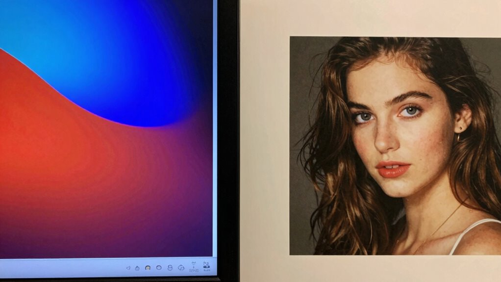
Why Color Accuracy Is Crucial for Printing and Screen Display

Because color accuracy directly impacts how your images and designs are perceived, it’s vital to guarantee consistency between screens and printed materials. Your viewers’ color perception can vary greatly if colors aren’t properly managed, leading to misinterpretations or disappointment. Digital color management helps ensure that colors stay consistent across different devices and formats. When you calibrate your screen correctly, you’re aligning your display’s colors with industry standards, making your digital work more reliable. This precision is essential for branding, marketing, and creative projects where precise color reproduction matters. Proper calibration also minimizes color shift that can occur during the printing process, ensuring the final product matches your original design. Understanding color management workflows can further enhance your ability to maintain color fidelity throughout your project. Additionally, employing hardware calibration tools can significantly improve the accuracy and consistency of your color reproduction. Prioritizing color accuracy helps you deliver professional results, whether digital or printed, and maintains your creative integrity.

Calibrite Display 123 Monitor Calibration Colorimeter for Photo Editing and Color Accurate Viewing, Easy 1 2 3 Software Workflow, USB C Connection, and Before and After Check, Supports 2 Displays
SPECIFICATIONS: Monitor calibration colorimeter with Easy 1 2 3 software workflow, USB C connection, compact body approx. 34mm…
As an affiliate, we earn on qualifying purchases.
As an affiliate, we earn on qualifying purchases.
Common Mistakes That Mess Up Your Color Calibration

One common mistake is neglecting to calibrate your monitor regularly, which can lead to inaccurate colors. Overlooking printer profiles also causes mismatches between what you see on screen and the final print. Ensuring both your monitor and printer are properly calibrated is essential for consistent color results. Incorporating Color Management techniques can help you achieve better color accuracy without relying on complex setups. Regularly updating color profiles ensures your devices stay aligned with industry standards for professional printing.
Ignoring Monitor Calibration
Ignoring monitor calibration is a common mistake that can seriously distort your color accuracy. Without proper calibration, your monitor may display colors that are inaccurate, leading to frustration and wasted effort. Here are three ways neglecting this step impacts you:
- You lose control over color consistency, making your work unpredictable.
- Your prints may not match what you see on screen, causing costly reprints.
- You’re left second-guessing whether your colors are truly precise, undermining confidence.
Failing to calibrate your monitor regularly compromises the foundation of your color workflow. It’s essential for maintaining consistent, reliable colors across your digital workspace, ensuring your screen truly reflects your vision. Don’t overlook this vital step—your work deserves accurate color.
Overlooking Printer Profiles
Failing to set up and use the correct printer profiles is a common mistake that can throw off your entire color calibration process. Printer profiles are essential for accurate color management, ensuring your prints match your on-screen colors. Without proper profile application, your printer may interpret colors incorrectly, leading to mismatches. Always select the right profile for your specific printer and paper type. Here’s a quick overview:
| Printer Model | Paper Type | Profile Name |
|---|---|---|
| Model A | Glossy Photo Paper | ModelA_Glossy_Profile |
| Model B | Matte Paper | ModelB_Matte_Profile |
| Model C | Fine Art Paper | ModelC_FineArt_Profile |
Proper profile application guarantees consistent, predictable results, preventing costly reprints and frustration.
Calibrite Display Pro HL Monitor Calibration Colorimeter for LCD Mini LED and OLED Displays, Measure up to 3000 Nits, PROFILER Software, USB C with Adapter, Validation/Color Uniformity Tools
SPECIFICATIONS: HL high luminance sensor colorimeter measures up to 3000 nits, calibrates and profiles LCD mini LED OLED…
As an affiliate, we earn on qualifying purchases.
As an affiliate, we earn on qualifying purchases.
How to Calibrate Your Monitor for True-to-File Colors

Calibrating your monitor guarantees that the colors you see on screen match the actual files you’re working with. Proper monitor calibration ensures your color profiles are accurate, preventing surprises when printing. To start:
- Use a hardware calibration tool—this device measures your display’s colors precisely, giving you a solid baseline.
- Adjust your monitor’s settings—set brightness, contrast, and gamma to ideal levels for consistent color reproduction.
- Apply calibrated color profiles—these profiles standardize your display’s output, making sure what you see matches your files.
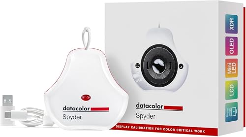
datacolor Spyder – Monitor Calibrator for Graphic Designers, Photographers, and Content Creators, Shows You True Colors, Works on OLED Monitors & LED Screens, Easy-to-Use Color Calibration Tool
Color “Surprises” Are a Thing of the Past: Datacolor’s exclusive DevicePreview TM Beta feature simulates what your photos…
As an affiliate, we earn on qualifying purchases.
As an affiliate, we earn on qualifying purchases.
Choosing the Right Color Profiles and Calibration Software
Choosing the right color profiles and calibration software is essential to achieving accurate and consistent colors across your workflow. Your color profile selection impacts how colors are interpreted between devices, so selecting profiles tailored to your monitor and printer ensures better color matching. When evaluating calibration software choices, prioritize tools that offer precise control, user-friendly interfaces, and compatibility with your hardware. High-quality calibration software helps you create accurate profiles by adjusting your display and printer settings effectively. Avoid generic profiles; instead, opt for custom profiles that match your specific equipment. Proper calibration and profile selection reduce discrepancies between on-screen colors and printed output, streamlining your process and saving time. Additionally, understanding the color management principles behind calibration can significantly improve your results. Remember, the right combination of color profiles and calibration software is the foundation for consistent, professional results. To achieve optimal results, familiarize yourself with the calibration process and how it influences color accuracy. Incorporating device-specific profiles into your workflow can further enhance color fidelity and overall output quality. Paying attention to monitor calibration ensures that your display accurately reflects the colors you intend to print or present. Using proper lighting conditions in your workspace can also help maintain consistent color perception during calibration and editing.
Calibrating Your Printer for Accurate Color Output

To achieve accurate color output from your printer, you need to calibrate it properly. This is essential for effective color management and consistent results. Proper calibration techniques involve more than just adjusting settings; they guarantee your printer’s colors match your expectations. Here’s what you should focus on:
- Use color calibration tools to create custom profiles tailored to your printer and paper type.
- Maintain consistent environmental conditions—avoid direct light and temperature fluctuations during calibration.
- Regularly recalibrate to account for ink, paper changes, and printer aging, keeping your colors true.
Troubleshooting Color Mismatches: What to Do When Calibration Fails
When calibration doesn’t fix color issues, you need to reassess your settings to spot any mistakes or inconsistencies. Using professional calibration tools can help improve accuracy beyond basic adjustments. Cross-check your results with multiple devices to identify whether the problem lies with your equipment or the process itself. Additionally, understanding the importance of color management can provide deeper insights into maintaining consistent color output across different media. Incorporating proper calibration procedures can also prevent future discrepancies and ensure more reliable color reproduction. Recognizing the role of quality control in color calibration processes can further enhance your results and reduce errors. Implementing standardized workflows can help maintain consistency and improve overall calibration accuracy. Familiarity with monitor calibration techniques can also optimize your setup for more precise color matching.
Reassess Calibration Settings
If calibration settings aren’t producing consistent color matches between your screen and print, it’s time to reevaluate them. Start by double-checking your monitor settings—small adjustments can make a big difference. Next, consider your ambient lighting; harsh or inconsistent lighting can distort how colors appear on your screen. Finally, revisit your calibration process: ensure your display’s brightness, contrast, and color temperature are set correctly.
- Confirm your monitor settings align with your workflow.
- Optimize ambient lighting to reduce glare and reflections.
- Recalibrate using consistent, controlled lighting conditions.
Taking these steps helps you regain control over color accuracy, giving you confidence that what you see on screen matches your printed work. Reassessing calibration settings isn’t just technical—it’s essential to achieving perfect color harmony.
Use Professional Calibration Tools
Sometimes, manual calibration methods can fall short, especially when color mismatches persist despite your efforts. In such cases, investing in professional calibration tools can make a significant difference. These tools provide precise control over color management, ensuring your monitor displays colors accurately. Calibration techniques using hardware calibration devices, like colorimeters or spectrophotometers, eliminate guesswork and deliver consistent results. They create custom profiles tailored to your specific display, helping you achieve better screen-to-print color consistency. While manual adjustments rely on visual judgment and generic settings, professional tools automate the process, reducing errors. By upgrading your calibration approach, you gain confidence that your colors are correctly represented across devices, minimizing the frustrating mismatch between screen and print outputs. Additionally, understanding color management workflows can further optimize your calibration process and improve overall color accuracy.
Cross-Check With Multiple Devices
Even after investing in professional calibration tools, color mismatches can still occur. To troubleshoot effectively, cross-check your work across multiple devices. This helps identify issues related to device compatibility and guarantees better color consistency. Understanding calibration is essential to ensure that your efforts lead to accurate and reliable color reproduction. Additionally, comparing calibrated displays with standardized color references can further improve your calibration accuracy. Recognizing the influence of device-specific settings can also aid in achieving consistent results across various screens.
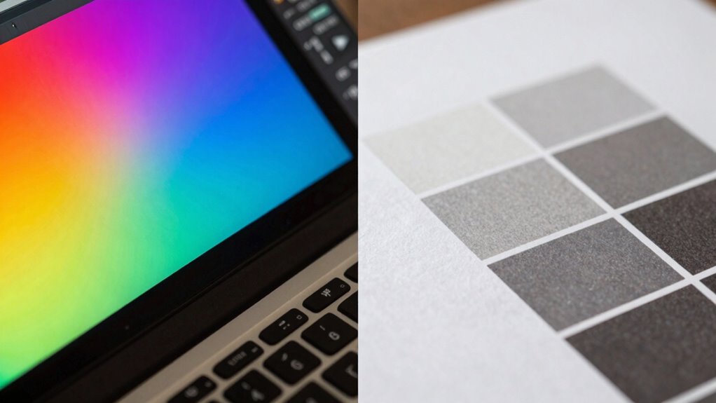
RGB vs. CMYK: Which Color Space Is Right for Your Projects?

Choosing the right color space is essential for ensuring your project looks its best across different mediums. RGB and CMYK serve different purposes: RGB offers a broader color gamut and higher color depth, ideal for screens. CMYK, with a narrower gamut, is designed for print and more accurate color reproduction on paper. Understanding these differences helps prevent color mismatches.
| Aspect | RGB | CMYK |
|---|---|---|
| Color Gamut | Wider, more vibrant colors | Narrower, less vibrant |
| Usage | Digital screens | Printing |
| Color Depth | Higher (more bits per channel) | Lower (fewer bits per channel) |
| Flexibility | Easier for editing | Limited in editing options |
| Output | Bright, vivid displays | Accurate print colors |
Next Steps: Maintaining Accurate Colors Over Time
Maintaining consistent and accurate colors over time requires ongoing attention beyond selecting the right color space. To guarantee calibration consistency, you must regularly adjust and verify your equipment. Here’s what you should do:
- Schedule routine calibration checks to catch drifting colors early.
- Use professional color management tools to maintain accurate color profiles.
- Keep detailed records of calibration dates and settings for reference.
- Be aware of how thermal behavior can influence calibration accuracy, especially in high-heat outdoor cooking environments.
- Regularly monitor calibration drift to ensure ongoing color accuracy and prevent discrepancies over time.
- Understanding how environmental factors affect your calibration can help maintain consistent results over long periods.
- Additionally, staying informed about device aging and its impact on display performance can help you proactively address potential issues before they affect color accuracy.
- Incorporating monitor calibration routines into your workflow can also help sustain reliable color reproduction over time.
Frequently Asked Questions
How Often Should I Recalibrate My Monitor and Printer?
You should recalibrate your monitor every 2 to 4 weeks to guarantee color accuracy, especially if you notice color shifts or changes. For your printer, follow a regular printer recalibration schedule, ideally once a month or whenever you change ink or paper types. Regular calibration maintains consistent color output, preventing mismatches between your screen and print, and keeps your work looking professional.
Can Ambient Lighting Affect Color Calibration Accuracy?
Ambient lighting affects your color calibration like a chameleon changes its hue; it can skew your color perception. When your surroundings are too bright or too dim, it’s harder to see true colors on your screen, leading to inaccurate calibration. To maintain consistent color accuracy, work in controlled lighting conditions, and avoid shifting ambient light that can distort how colors appear and compromise your calibration efforts.
What Are the Signs of a Miscalibrated Display or Printer?
If your display or printer shows a color shift or looks inconsistent with expected hues, you’re likely experiencing calibration errors. Signs include images appearing too dull, overly saturated, or colors not matching your reference. You might also notice subtle differences between screens and printed output. Regularly check for these signs, and recalibrate your devices to prevent color shift and guarantee accurate color reproduction across screens and prints.
Is Professional Calibration Necessary for Casual or Hobby Projects?
You don’t need professional calibration for casual or hobby projects, as studies show that many hobbyists achieve satisfactory results with simple techniques. Casual calibration, using basic tools or built-in software, can markedly improve your color accuracy without the expense of professional services. For most hobbyist techniques, fine-tuning your display and printer settings at home is enough to produce vibrant, accurate prints and screens, making your projects look more polished and consistent.
How Do Different Printing Substrates Impact Color Fidelity?
Different printing substrates markedly impact color fidelity due to their surface texture and color absorption. A smooth, glossy surface reflects more ink, maintaining vibrant colors, while a matte or textured surface absorbs more ink, dulling the appearance. You should consider these factors when selecting substrates, as they influence how colors appear in print, ensuring your final output matches your expectations. Adjust your color management accordingly for the best results.
Conclusion
To guarantee your colors match perfectly across screens and print, don’t skip calibration—it’s essential. While some might think it’s complicated or time-consuming, investing in proper calibration tools and knowledge pays off with consistent, professional results. Remember, even slight deviations can impact your work’s quality and credibility. With regular calibration and attention to detail, you can confidently produce accurate, vibrant colors that impress, no matter the medium.