To enhance your crafting skills, understanding color theory is essential. Focus on creating harmonious palettes using complementary, analogous, or triadic schemes to bring balance and vibrancy. Use contrast wisely to emphasize focal points or create mood. Knowing how colors evoke emotions helps communicate your message effectively. Experimenting with blending and mixing broadens your options and adds depth. Continue exploring these principles to transform simple ideas into mesmerizing, meaningful projects that truly stand out.
Key Takeaways
- Understand color harmonies like complementary, analogous, and triadic schemes to create balanced and striking craft projects.
- Use contrast effectively by combining light/dark or complementary colors to add visual interest and guide viewer focus.
- Master color mixing to expand your palette, control shades, and achieve desired tones for depth and harmony.
- Recognize color symbolism and emotional impacts to reinforce your craft’s message or theme.
- Apply principles of color theory to enhance aesthetic appeal, ensuring your projects are both visually pleasing and meaningful.
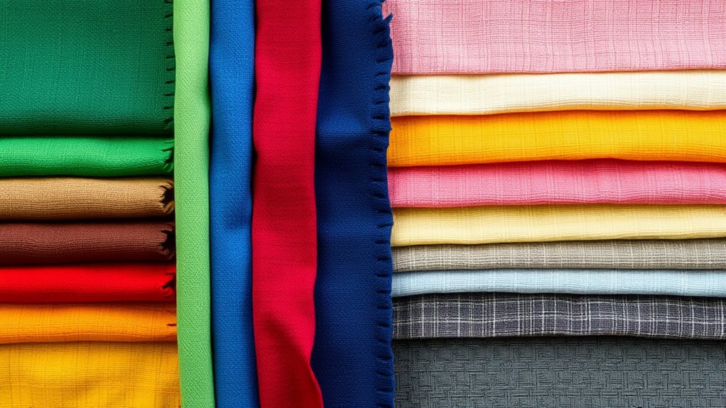
Understanding color theory is essential for crafters who want to create visually appealing projects. It helps you choose the right colors, combine them effectively, and communicate the desired mood or message. When you immerse yourself in color mixing, you learn how primary colors blend to produce secondary and tertiary hues, giving you a broader palette to work with. By mastering color mixing, you gain control over shades and tones, ensuring your projects have depth and harmony. Recognizing how colors interact allows you to craft compositions that are balanced or intentionally striking, depending on what you aim to achieve.
Mastering color mixing unlocks endless creative possibilities for balanced, vibrant, and harmonious craft projects.
Color symbolism plays an indispensable role in shaping how your projects are perceived. Different colors evoke specific emotions and associations—red can symbolize passion or urgency, blue often represents calm or trust, and yellow might convey happiness or energy. When you understand color symbolism, you can select colors that reinforce your message or theme, making your craft more meaningful. For example, if you’re designing a heartfelt gift, choosing warm, comforting colors like soft reds and gentle oranges can evoke feelings of warmth and love. Conversely, cooler tones might be more suitable for projects meant to inspire tranquility or professionalism.
Knowing how to combine colors effectively involves understanding color harmonies. Complementary colors—those directly opposite each other on the color wheel—create vibrant contrasts that draw attention and add excitement. Analogous colors, which sit next to each other, produce serene and cohesive looks, perfect for subtle or sophisticated designs. Triadic schemes, using three evenly spaced hues, balance vibrancy and harmony, making your projects lively without feeling chaotic. By applying these principles, you can craft color combinations that captivate the eye and support the overall aesthetic.
Furthermore, understanding contrast is pivotal. High contrast, achieved through pairing light and dark shades or complementary colors, can make elements stand out and add visual interest. Low contrast, using similar tones, offers a soft, unified appearance, ideal for backgrounds or understated details. Knowing when to use contrast helps you guide the viewer’s focus and create visual flow within your project.
Additionally, exploring color schemes such as monochromatic or split-complementary palettes can expand your creative options and help you craft more dynamic and engaging designs. Ultimately, mastering these aspects of color theory empowers you to make intentional decisions in your craft. Whether you’re mixing colors to get just the right hue, selecting colors based on their symbolism, or creating harmonious palettes, your projects will benefit from a thoughtful approach. With this knowledge, you can elevate your crafting from simple decoration to expressive art that communicates and resonates.
Frequently Asked Questions
How Do I Choose Colors for Seasonal Crafts?
To choose colors for seasonal crafts, start with the color wheel applications to identify complementary and analogous hues that evoke the season’s vibe. Use color mixing techniques to create shades that match your theme, like warm reds and oranges for fall or cool blues and greens for winter. Trust your instincts, but also experiment with different combinations until you find a palette that feels fresh and fitting for the season.
What Are Common Color Mistakes to Avoid?
Avoid massive color clashes that scream “bad taste” and overusing neutrals that drain energy from your project. Don’t let color clashing turn your masterpiece into chaos or rely too much on neutrals, making your craft look dull and lifeless. Balance is key—use contrasting hues thoughtfully and sprinkle neutrals sparingly. Keep your colors harmonious, vibrant, and engaging, or risk ending up with a project that’s forgettable.
How Can I Create a Balanced Color Palette?
To create a balanced color palette, start with complementary color schemes to add visual interest, but use them sparingly to avoid overwhelming your design. Follow color harmony principles, such as balancing warm and cool tones, to make certain your colors work well together. Incorporate neutral shades to ground your palette, and test your choices in different lighting conditions to see how they interact and maintain harmony throughout your project.
Which Colors Evoke Specific Emotions or Moods?
Bright yellow sparks joy and optimism, while deep blue evokes calm and trust through psychological associations. Red often stirs passion and energy, contrasting with soothing green, which symbolizes growth and harmony. Cultural symbolism also influences emotions; white can represent purity, and black can suggest sophistication or mourning. By understanding these color cues, you can craft projects that evoke specific moods, creating a powerful emotional connection with your audience.
How Do Lighting Conditions Affect Color Choices?
Lighting conditions considerably impact your color choices because they influence color perception. Bright, natural light makes colors appear more vibrant, helping you see true hues, while dim or artificial lighting can dull or alter them. When planning your project, consider how different lighting impacts the overall look, ensuring your colors harmonize under various conditions. Adjust your palette accordingly to achieve the desired mood and consistency in all lighting environments.
Conclusion
Now that you’ve explored color harmonies, contrasts, and palettes, you’re ready to make your projects truly pop, like a modern-day Michelangelo of crafts. Remember, experimenting with colors can turn even the dullest fabric into a masterpiece. Don’t be afraid to break the rules—think of it as your own Renaissance. With these tips, your creations will be as striking as a painting in the Louvre. Happy crafting, and may your colors always be in perfect harmony!