
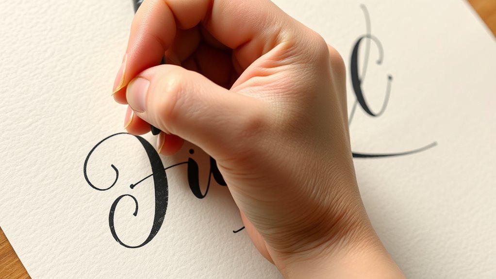
If you’re new to hand lettering, faux calligraphy is a great way to get started without needing advanced skills. Choose smooth pens like felt-tips or fineliners and practice basic strokes, focusing on applying light pressure on upstrokes and heavier pressure on downstrokes to create contrast. Keep your hand steady and consistent, and experiment with decorative elements to style your letters. If you keep practicing, you’ll discover simple tricks to make your lettering look elegant and polished.
Key Takeaways
- Use simple strokes with light pressure for upstrokes and heavier pressure for downstrokes to mimic traditional calligraphy.
- Select smooth, easy-to-control pens like felt-tips or fineliners for consistent lines.
- Practice basic shapes and repeated strokes to build muscle memory and control.
- Incorporate decorative elements such as loops, swirls, and borders to enhance your lettering.
- Use grids or guides to maintain uniform size, spacing, and alignment in your designs.
Understanding Faux Calligraphy: The Basic Concept

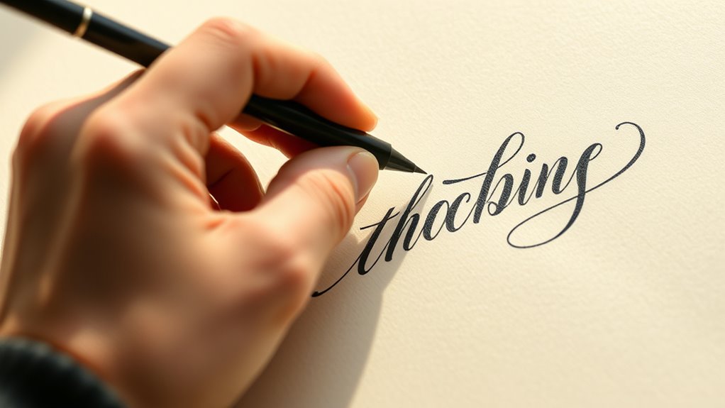
Understanding faux calligraphy is a simple way to add a hand-lettered look to your designs without needing advanced skills. It involves creating the appearance of traditional calligraphy by adding extra strokes to your letters. To start, focus on your pen grip, holding it comfortably to control ink flow smoothly. A steady grip helps prevent uneven lines and allows for consistent pressure, which is key to achieving the right look. As you write, apply light pressure on the downstrokes to make the lines thicker, then lift slightly on the upstrokes for thinner lines. This technique mimics the natural variation found in real calligraphy. Additionally, understanding lifestyle and how it influences creative habits can motivate consistent practice and improvement. Incorporating consistent pressure control during your strokes enhances the realism of faux calligraphy. With practice, you’ll find it easier to produce clean, professional-looking faux calligraphy that enhances your projects without complex tools or techniques.
Picking the Right Tools for Faux Calligraphy

Choosing the right tools is essential for creating effective faux calligraphy. Your pen nibs should be smooth and easy to control, helping you achieve clean, consistent strokes. Felt-tip pens or fineliners with varied nib sizes work well for beginners because they allow you to vary line thickness easily. When selecting ink types, opt for quick-drying, smudge-resistant inks to keep your work neat. Water-based inks are beginner-friendly and less messy, while alcohol-based inks offer bolder, more vibrant results. Avoid overly thick or bleeding inks that can make your lines fuzzy. The key is to experiment with different pen nibs and inks to find what feels comfortable and produces the sharp, crisp lines you want in your faux calligraphy projects. Additionally, understanding resources and tools available can help you choose the best equipment for your skill level and desired outcome. Exploring different pen types can further expand your creative options and improve your technique. Incorporating knowledge about sound vibrations and their effects on cellular health can inspire you to incorporate rhythm and flow into your lettering style. For example, paying attention to visual harmony in your strokes can enhance the overall aesthetic of your work, especially when considering how precious metals can serve as a metaphor for balance in design.
Practicing Basic Letter Shapes and Strokes
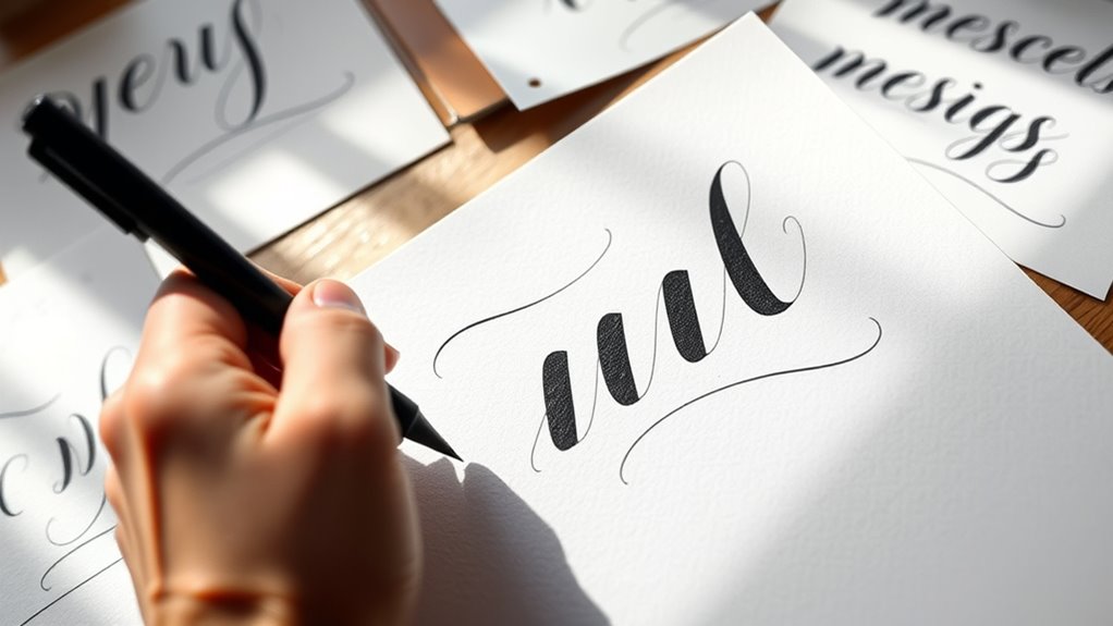
Before diving into complex lettering, it’s essential to master the basic shapes and strokes that form every letter. Practicing simple strokes helps you develop control and confidence, making it easier to create letter shape variations later. Focus on consistent stroke techniques, like straight lines, curves, and loops, to build a solid foundation. Repetition is key—try drawing each shape repeatedly until it feels natural. Understanding how strokes connect and vary will improve your overall style. Remember, mastering these basics isn’t about perfection but about building muscle memory. Use the table below to reflect on how stroke techniques influence letter shapes: passive voice detection
| Stroke Technique | Letter Shape Variation |
|---|---|
| Thick to thin | Emphasizes contrast and style |
| Light curves | Creates fluid, elegant forms |
| Sharp angles | Adds structure and emphasis |
Additionally, practicing varied stroke techniques can help you develop a more dynamic and personalized lettering style. Incorporating fundamental letter strokes into your practice routine ensures consistent progress and helps you create cohesive, professional-looking lettering. Regularly analyzing how different stroke techniques impact the overall appearance of your work can deepen your understanding of letter construction, especially when considering the Nail Styles Names that influence overall aesthetic harmony.
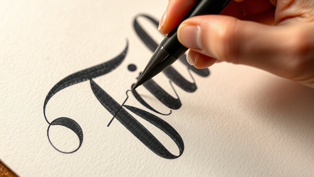
How to Create Downward Stroke Thickening

To create a dynamic and visually interesting letter, you need to learn how to thicken your downward strokes effectively. Start by applying pressure on the pen as you move downward, gradually increasing it to create a bold stroke. For curved strokes, use smooth, consistent pressure to maintain even thickness and avoid jagged lines. Practice controlling your grip to achieve fluid motion. To add depth, blend colors effectively by layering different shades on the thickened strokes, enhancing the illusion of dimension. This technique helps your lettering pop and feels more lively. Remember, consistent pressure and smooth curves are key. With practice, you’ll develop a natural feel for where and how to thicken your strokes, making your faux calligraphy look polished and professional. Additionally, studying tuning Hyundai models can inspire you to approach your lettering with precision and customization, much like fine-tuning a vehicle for optimal performance. Developing a steady hand and mindful pressure control can also be complemented by exploring digital creativity, which offers innovative tools to refine your lettering skills even further. Focusing on vehicle tuning techniques can also help you understand the importance of detailed adjustments for achieving a flawless finish. Moreover, paying attention to security zone info principles, such as precise and consistent modifications, can improve your overall technique and results.
Adding Flare and Style to Your Letters
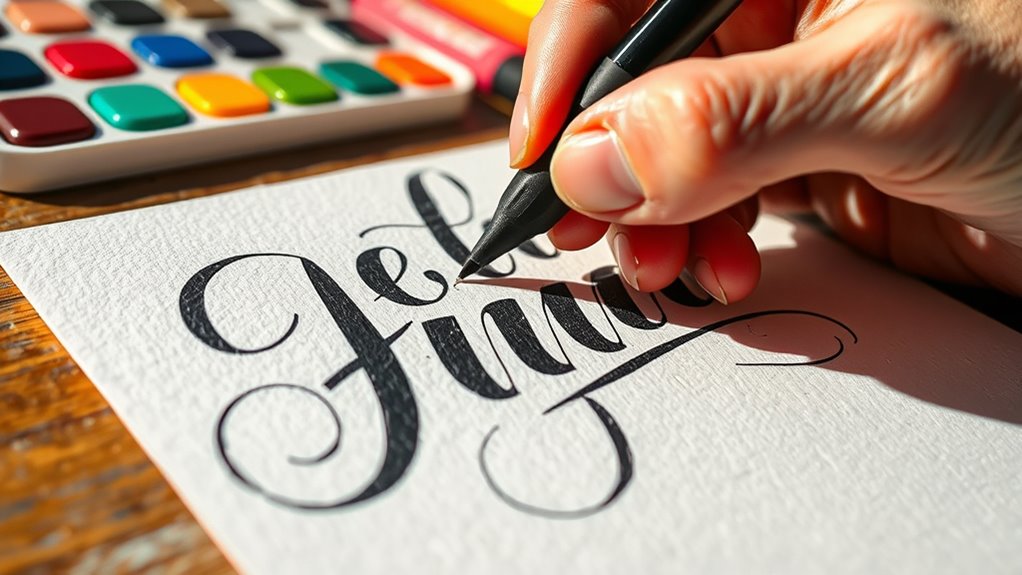
To add flair and style, start by incorporating decorative elements like swirls or banners to enhance your letters. Varying line thickness can also create visual interest and emphasize certain parts of your design. Experimenting with these techniques helps your lettering stand out and express your unique style. Incorporating creative gardening techniques can inspire more personalized and artistic approaches to your lettering projects.
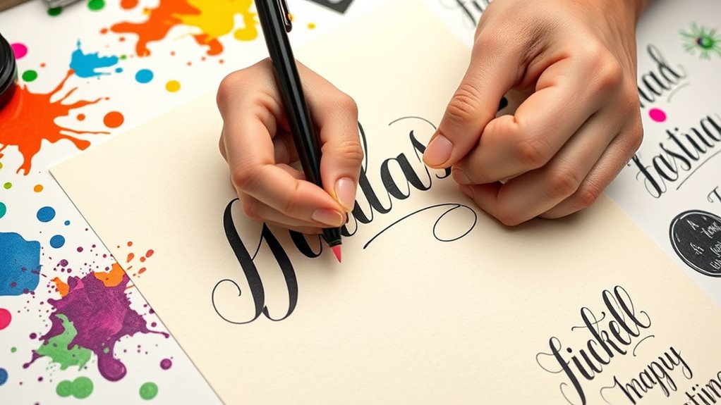
Incorporate Decorative Elements
Have you ever wondered how to make your hand lettering stand out? Adding decorative elements can give your work a unique flair. Use decorative borders to frame your words, creating a polished look that draws attention. Embellishment techniques like small flourishes, dots, or swirls add charm and personality. These simple touches evoke emotion and make your lettering more engaging.
To get started, consider:
- Incorporating decorative borders that complement your style
- Adding flourishes or swirls to emphasize certain words
- Using embellishments like dots or stars for extra detail
These techniques transform plain lettering into eye-catching art, making your pieces feel more intentional and lively. Don’t be afraid to experiment—these small decorative elements can truly elevate your hand lettering to the next level.
Vary Line Thickness
Varying line thickness is a powerful way to add flair and personality to your hand lettering. Using brush pens makes it easy to create natural variation, as you can press harder for thicker strokes and lighten for thinner lines. This technique adds depth and style to your letters, making them more dynamic. If you’re working digitally, tools like digital brushes or pen settings can mimic this effect, allowing you to experiment without physical limits. Practice switching pressure or adjusting stroke size to develop a sense of flare and emphasis. Whether with traditional brush pens or digital tools, mastering line thickness adds a professional touch and helps your lettering stand out. It’s a simple trick that instantly elevates your lettering style.
Experimenting With Different Lettering Styles
Since experimenting with different lettering styles can boost your creativity, it’s important to try out a variety of techniques and see what resonates with you. Exploring calligraphy vs lettering helps you understand the differences, like the flow of calligraphy versus the boldness of hand-drawn fonts. Don’t be afraid to create your own handmade fonts, adding a personal touch to each project. Trying different styles can evoke strong emotions and inspire unique designs.
- Feel the joy as your hand guides each letter, making your work truly yours
- Experience the thrill of discovering new styles that surprise you
- Find confidence in blending styles to create something uniquely yours
Tips for Maintaining Consistency in Your Hand Lettering

To keep your hand lettering consistent, it helps to practice repetition regularly so your skills stay sharp. Using guides and grids can also give you a clear framework to follow, ensuring your letters stay uniform. Incorporating these tips will make your lettering more polished and cohesive over time.
Practice Repetition Regularly
Practicing your hand lettering regularly is essential for building consistency and improving your skills. By making practice repetition a daily habit, you reinforce muscle memory and develop a steady hand. Daily drills help you notice progress and boost confidence, turning mistakes into learning opportunities. To stay motivated, keep these in mind:
- Celebrate small wins with each completed practice session
- Set achievable goals to track your growth
- Remember that consistency beats intensity in the long run
Regular practice keeps your hand steady and sharpens your eye for detail. Even just a few minutes each day can make a big difference over time. Stick with it, and you’ll see your faux calligraphy become more polished and confident.
Use Guides and Grids
Using guides and grids is one of the most effective ways to maintain consistency in your hand lettering. They help you with proper grid alignment, ensuring each letter stays uniform in size and spacing. Start by lightly sketching guide placement on your paper, using horizontal lines to keep your lettering straight and even. You can also add vertical lines to guide the width of your letters. These grids act as visual cues, helping you stay on track as you work through your lettering. As you become more comfortable, you can vary the grid size to create different styles or effects. Remember, consistent guide placement is key to achieving a polished, professional look in your hand lettering projects.
Incorporating Faux Calligraphy Into Crafts and Projects

Have you considered adding faux calligraphy to your crafts and projects for a stylish, hand-lettered look? This technique connects calligraphy history with modern applications, making your creations feel personal and unique. Faux calligraphy works well on greeting cards, home décor, or personalized gifts, giving them an elegant touch without needing extensive skills.
By incorporating faux calligraphy, you can evoke feelings of warmth, creativity, and sophistication. It’s simple to learn and instantly elevates your projects.
- Create heartfelt messages that resonate emotionally
- Transform everyday items into art pieces
- Add a handcrafted touch that impresses friends and family
Troubleshooting Common Mistakes and Challenges
Even experienced letterers encounter common mistakes that can disrupt the flow and appearance of faux calligraphy. One challenge is uneven color blending, which can make your strokes look inconsistent. To fix this, blend colors smoothly by using gentle transitions and layering. Another issue is improper letter spacing, resulting in letters that feel crowded or too spaced out. Pay close attention to maintaining consistent spacing between letters to improve readability and overall balance. Overlapping strokes or inconsistent pressure can also distort your letter shapes. Practice controlled pressure and keep your strokes steady. Remember, mistakes are part of the learning process. With patience, you can identify errors like uneven color blending or letter spacing issues and correct them for a cleaner, more polished faux calligraphy style.
Advancing Your Faux Calligraphy Skills Over Time
As you continue practicing faux calligraphy, your skills will naturally improve with consistent effort and deliberate focus. Over time, you’ll notice your lettering inspiration grows, fueling motivation to push your skill progression further. To advance, challenge yourself with new styles, experiment with different tools, and set achievable goals. Remember, progress isn’t always linear, but persistence pays off. Celebrate small victories, like mastering consistent downstrokes or refining curves. Keep a sketchbook to track your growth and revisit your early work to see how far you’ve come. Embracing these habits will build confidence and refine your technique, making faux calligraphy feel more natural and enjoyable. Your dedication will turn initial struggles into a rewarding creative journey.
Frequently Asked Questions
Can Faux Calligraphy Be Used on Different Types of Paper?
Yes, you can use faux calligraphy on a variety of papers, including textured surfaces. It works well on smooth paper, cardstock, and even craft paper, giving you versatility. Keep in mind, textured surfaces might require you to apply gentler pressure or use finer pens for cleaner lines. Experimenting with different papers helps you discover what works best for your style and guarantees your faux calligraphy looks polished everywhere.
How Do I Fix Mistakes in Faux Calligraphy?
When correcting errors in faux calligraphy, you can carefully erase ink smudges with a clean eraser if the ink is still wet or light enough. For stubborn mistakes, use a white gel pen or correction pen to cover errors, then rewrite your strokes. If the ink has dried, you might need to carefully touch up with a matching pen. Practice patience, and don’t be afraid to fix mistakes to improve your lettering.
Is Faux Calligraphy Suitable for Digital Design Projects?
Faux calligraphy works well for digital design projects because it offers a handcrafted look that adds personality. You can easily incorporate it into digital workflows, allowing seamless digital integration. Pair it with complementary fonts for a polished finish, enhancing your overall design. Whether for logos, social media graphics, or invitations, faux calligraphy offers versatility, giving your digital projects a unique, personalized touch that stands out.
What Are Some Beginner-Friendly Faux Calligraphy Projects?
Did you know that beginner projects boost confidence by 80%? For easy faux calligraphy projects, start with practice quotes or greeting cards. Use simple brush pen techniques to create thick and thin strokes, experimenting with lettering style variations. You’ll learn to control pressure and develop a steady hand, making your writing more stylish and polished. These projects are perfect for building your skills and enjoying creative expression without needing advanced art skills.
How Long Does It Take to Master Faux Calligraphy Techniques?
It varies for everyone, but mastering faux calligraphy depends on your practice consistency and patience needed. If you practice regularly, you might see improvement in a few weeks, while true mastery could take months. Keep practicing daily, stay patient, and don’t rush. Over time, your confidence and skill will grow, making faux calligraphy feel more natural and enjoyable. Remember, steady effort is the key to progress.
Conclusion
With a little practice, faux calligraphy becomes a fun way to add personalized flair to your projects. Remember, Rome wasn’t built in a day—so be patient and keep experimenting. As you refine your skills, you’ll find your style evolving naturally. Don’t be afraid to make mistakes—they’re just stepping stones to mastery. Keep practicing, stay creative, and soon you’ll be surprising yourself with beautiful hand lettering!