When color goes wrong, start by identifying whether your issue needs minor tweaks or major adjustments using editing tools to experiment with hue, saturation, contrast, and other parameters. Communicate clearly with clients by explaining your corrections, showing before-and-after visuals, and inviting feedback. Focus on matching the color palette to the original vision, and use software like DaVinci Resolve or Adobe Premiere for precise control. Keep refining your approach as you learn more about effective color correction techniques.
Key Takeaways
- Use targeted color correction tools to adjust hue, saturation, and contrast for a more accurate or desired look.
- Communicate transparently with clients about the issues and proposed fixes, using before-and-after comparisons.
- Revisit initial project references or mood boards to realign the color palette with the original vision.
- Experiment with subtle tweaks to achieve the best match without overcorrecting, ensuring color consistency.
- Maintain clear, direct communication to keep clients informed and collaboratively refine the project’s color grading.
Have you ever watched a project go off track because the colors just didn’t turn out the way you envisioned? It’s frustrating when you put so much effort into getting the perfect palette, only to find the final result isn’t what you imagined. But don’t panic. With a clear plan and good communication, you can often salvage the project and satisfy your client. The key is understanding color correction techniques and maintaining open, honest client communication throughout the process.
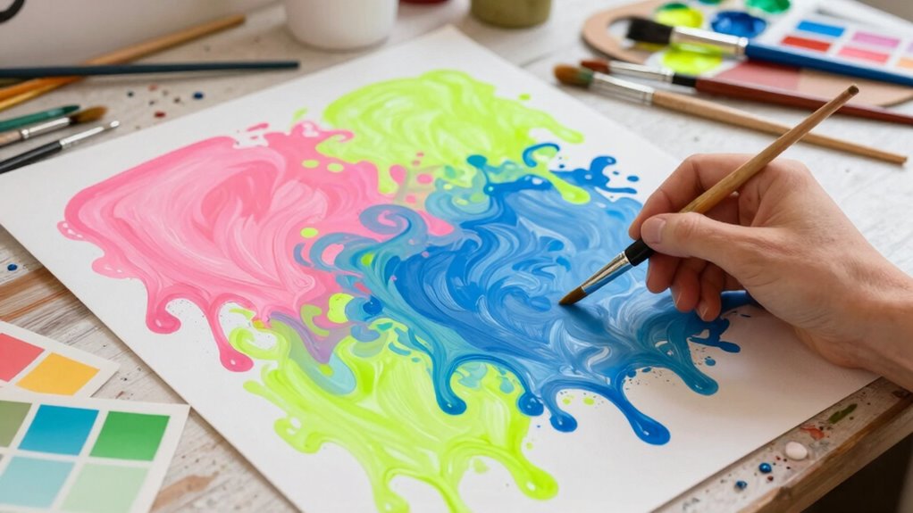
When you realize the colors are off, assess the situation quickly. Is it a matter of minor tweaks or a more substantial shift? Color correction involves adjusting hues, saturation, contrast, and other parameters to bring the project closer to the desired look. Don’t be afraid to experiment with editing tools—sometimes subtle adjustments can make a big difference. If you’re working with video or photography, specialized software like DaVinci Resolve or Adobe Premiere can help you precisely control these elements. Your goal is to match the color palette as closely as possible to the original vision or the client’s specifications.
Quickly assess if color issues need minor tweaks or major adjustments and experiment with editing tools to match the original vision.
Client communication is essential during this process. Keep your client in the loop about what’s going wrong and what steps you’re taking to fix it. Transparency builds trust and reassures them that you’re actively working to resolve the issue. If the colors are markedly off, explain why and outline your plan to correct the problem. Sometimes, clients may have different perceptions of color, so showing them before-and-after comparisons can help manage expectations and foster understanding. Encourage their feedback early so you can make adjustments aligned with their tastes. Additionally, understanding how color correction techniques work can help you better explain the adjustments and reassure clients that the final product will meet their expectations.
In some cases, you might need to revisit the initial concept or mood board to confirm everyone’s on the same page. Clarify whether the current correction aligns with their vision or if further adjustments are necessary. Remember, effective client communication isn’t just about updating them; it’s about listening to their concerns and incorporating their input. This collaborative approach often results in a better end product and a more satisfied client. Being familiar with automated grammar tools that spot passive voice can also help ensure your communication remains clear and direct, fostering better understanding.
video color correction software
As an affiliate, we earn on qualifying purchases.
As an affiliate, we earn on qualifying purchases.
Frequently Asked Questions
How Do I Identify the Root Cause of Color Issues?
You identify the root cause of color issues by analyzing how color theory and color psychology influence your project. Start by examining whether the chosen hues clash or convey the intended message, considering color harmony and contrast. Assess if your color choices evoke the desired emotional response. Testing different palettes and gathering feedback helps pinpoint problems, ensuring your colors align with your project’s goals and effectively communicate your message.
What Tools Can Help Correct Color Errors Quickly?
You can quickly correct color errors by using tools like color calibration devices and color profiling software. Color calibration guarantees your monitor displays accurate colors, helping you identify issues early. Color profiling creates specific color profiles for your device, allowing consistent color reproduction across different outputs. These tools streamline the correction process, enabling you to make precise adjustments swiftly, guaranteeing your project maintains accurate, vibrant colors from start to finish.
How Can I Prevent Color Problems in Future Projects?
Like a skilled navigator avoiding storms, you can prevent color problems by mastering color theory and understanding color psychology. Plan your palette carefully, considering how colors interact and evoke emotions. Test colors in small sections first, and get feedback before finalizing. Consistent use of color swatches and digital tools helps maintain harmony, ensuring your project stays visually appealing and emotionally resonant, reducing the risk of unexpected color mishaps.
What Are Common Mistakes That Lead to Color Mismatches?
You often cause color mismatches by neglecting color theory principles and ignoring pigment consistency. When you don’t understand complementary or analogous colors, you risk clashing or dulling your palette. Additionally, using inconsistent pigments—those that vary in saturation or transparency—can lead to unpredictable results. Always test your pigments beforehand and study color theory to create harmonious blends, minimizing mistakes and ensuring your project’s colors stay true.
When Should I Escalate a Color Problem to Management?
You should escalate a color problem to management immediately if it threatens to turn your project into a disaster of epic proportions. When the wrong color choice clashes with color psychology or misrepresents brand symbolism, it’s time to escalate. Ignoring these issues risks miscommunication, brand damage, and customer confusion. Don’t wait for the chaos to grow; involve management quickly to realign your colors with the intended message and impact.
professional photo editing tools
As an affiliate, we earn on qualifying purchases.
As an affiliate, we earn on qualifying purchases.
Conclusion
When your project’s colors start to clash, remember it’s like a painting gone astray—you can still save it. Step back, reassess your palette, and make deliberate adjustments. Embrace the opportunity to blend shades anew, turning a muddled masterpiece into a vibrant work of art. With patience and a steady hand, you’ll transform that chaotic canvas into a harmonious scene, proving that even when the colors go wrong, you hold the brush to bring it back to life.
color grading monitor
As an affiliate, we earn on qualifying purchases.
As an affiliate, we earn on qualifying purchases.
video editing color correction kit
As an affiliate, we earn on qualifying purchases.
As an affiliate, we earn on qualifying purchases.