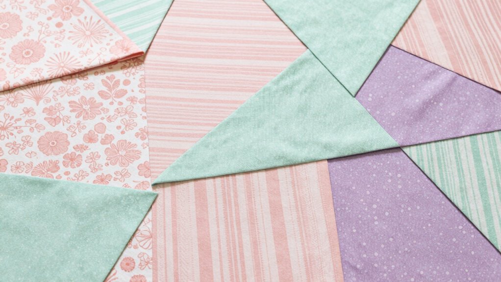

To stack patterns without clashing, focus on color coordination by using a consistent palette, like blue and white, to create a cohesive look. Balance scales by pairing large, bold patterns with smaller, delicate ones, ensuring no pattern overpowers the other. Use a dominant pattern as an anchor, with subtler accompanying prints. Repetition of patterns and attention to visual flow help avoid chaos. Keep these principles in mind, and you’ll master harmonious pattern mixing—there’s more to discover ahead.
Key Takeaways
- Use a consistent color palette to create visual cohesion across different patterns.
- Balance large and small patterns by pairing bold prints with delicate designs.
- Establish a dominant pattern and keep others more subdued for proportion.
- Incorporate repetition and similar colors to enhance visual flow and unity.
- Focus on contrast in scale to add rhythm without overwhelming the eye.
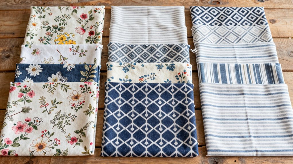
Mixing patterns can add exciting visual interest to your space or outfit, but it often feels risky if you don’t know how to do it right. The key to successfully stacking patterns is understanding how to use color coordination and scale balancing to create harmony instead of chaos. When you start mixing patterns, choose a common color palette to tie everything together. For example, if your patterns include shades of blue and white, sticking to these colors helps your patterns look intentional and cohesive. You don’t need everything to match perfectly, but having a shared color theme ensures your patterns don’t clash or compete for attention. This approach makes mixing patterns feel deliberate and polished rather than random or overwhelming. Additionally, paying attention to visual harmony can help you refine your pattern combinations for a more cohesive look. Scale balancing is equally important. Think of patterns in terms of their size—large, bold prints and small, delicate ones. To avoid visual overload, pair a large, statement pattern with smaller, subtler designs. For instance, a big floral print can be balanced with tiny polka dots or narrow stripes. This contrast in scale creates a rhythm and prevents any one pattern from dominating the entire look. If you go for two large patterns together, they might compete for attention, making the overall look feel chaotic. Conversely, pairing small patterns with large ones creates a sense of harmony, guiding the eye smoothly across your outfit or space. Always consider the proportion; if you’re using a dominant pattern, keep other patterns in the mix more understated. Recognizing pattern scale as a crucial element can help you achieve a more balanced and appealing combination. Being mindful of pattern repetition can also create a more unified and intentional appearance. Paying attention to visual flow can further enhance the overall cohesiveness of your pattern mix.
blue and white patterned throw pillows
As an affiliate, we earn on qualifying purchases.
As an affiliate, we earn on qualifying purchases.
Frequently Asked Questions
Can Stacking Patterns Work With Bold or Busy Prints?
Yes, stacking patterns with bold or busy prints can work if you pay attention to pattern size and texture. Opt for one pattern with a larger, more dominant design, and balance it with smaller, subtler patterns. Vary pattern textures, like mixing smooth with textured fabrics, to create visual interest without clashing. This approach helps your outfit look intentional and stylish, even with bold, busy prints.
How Do I Balance Colors When Stacking Multiple Patterns?
Balancing colors when stacking multiple patterns feels like walking a tightrope, but with the right approach, you’ll master it! Start with a neutral base and use color coordination to pick a few shades that tie everything together. Employ pattern mixing techniques like varying scales or sticking to complementary hues. Keep the overall look harmonious, not hectic, ensuring your patterns dance in harmony rather than clash.
Are There Specific Patterns That Clash More Often?
You should watch out for patterns with similar scales, as large and small patterns often clash if paired incorrectly. Stripes with busy florals or large checks can compete visually. Focus on color coordination to balance the look, and mix pattern scales thoughtfully—pair a small dot with a larger floral to create harmony. Avoid overly similar patterns to prevent clashes, and make sure the overall color palette complements each pattern for a cohesive ensemble.
How Can Accessories Help in Pattern Stacking?
Imagine accessor styling as your secret weapon in pattern coordination. Accessories help balance busy patterns by adding subtle pops of color or texture, creating harmony instead of chaos. A statement necklace or bold earrings can draw attention away from clashing prints, while scarves or belts can unify diverse patterns. Use accessories thoughtfully, and they’ll elevate your look, making pattern stacking look effortlessly chic rather than overwhelming.
Is There a Rule for Mixing Patterns in Formal Wear?
In formal wear, there’s no strict rule for mixing patterns, but focusing on pattern symmetry helps you create a balanced look. Pair a patterned blazer with a subtly textured shirt or tie, ensuring the patterns complement in scale and style. Mix different fabric textures—like silk with wool—to add depth. Keep colors coordinated, and avoid overwhelming the outfit by sticking to one or two patterns, letting each piece stand out.
Conclusion
By mixing patterns thoughtfully, you’re like a skilled chef blending flavors—creating harmony rather than chaos. Remember, balance is key: vary your scales, keep colors complementary, and don’t be afraid to experiment. When you master pattern stacking, your style becomes a vibrant tapestry that reflects your personality. So go ahead, play with prints confidently—just like a painter with a palette—because with a little practice, you’ll turn clashing into mesmerizing.