
To line up multiple colors easily, start with a clear, organized setup using visual aids like grids, crosshairs, and numbered tabs. Use contrasting markers for better visibility and draw light guidelines first, then refine with darker marks. Rely on proven tools and software to maintain color accuracy, and incorporate consistent spacing and markers to reduce misregistration. Keep your workspace tidy and check alignment regularly. If you want expert tips on achieving flawless registration, there’s more to discover here.
Key Takeaways
- Use visual aids like grids, crosshairs, and numbered tabs to establish clear reference points for alignment.
- Draw light guidelines first, then refine with darker marks to improve precision during registration.
- Maintain consistent spacing and markers to ensure accurate multi-color alignment throughout the process.
- Regularly check registration with visual aids to catch and correct misalignment early.
- Keep the workspace tidy and organized to prevent accidental shifts and facilitate easy adjustments.
What Are the Biggest Challenges in Color Registration: and How Can You Fix Them?
Color registration can be tricky because minor misalignments lead to blurred images or color fringes that ruin the final print. Understanding color theory helps you grasp how colors interact and how slight shifts can affect overall print accuracy. When colors are misaligned, it disrupts the harmony you aim for, making images look fuzzy or distorted. The key challenge is maintaining precise registration across multiple layers of color, which becomes difficult with overlapping or adjacent inks. To fix this, you need to pay close attention to your printing process, ensuring proper calibration and using registration marks. Consistent color registration ensures that each hue lines up perfectly, resulting in sharp, vibrant images that match your original design with clarity. Additionally, implementing advanced calibration techniques can help maintain alignment over long print runs, reducing errors and waste. Maintaining proper color management throughout the process is essential for achieving accurate and consistent registration.
How to Design Consistent Color Palettes for Easy Registration

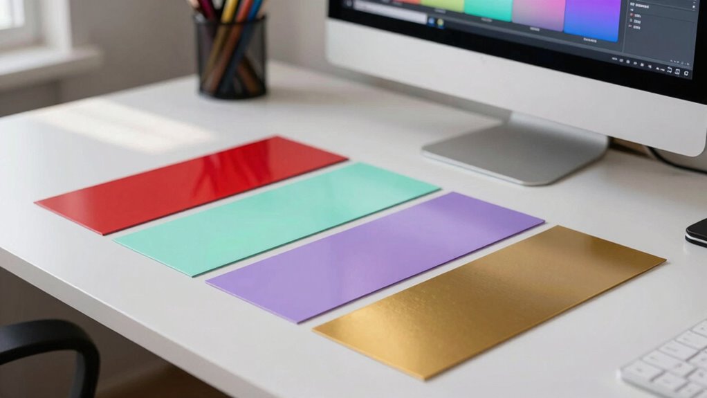
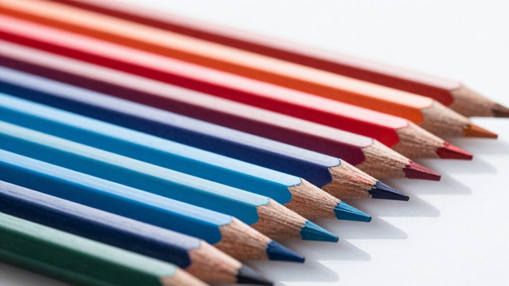
Designing a consistent color palette is a smart way to make registration easier and more reliable. Focus on achieving color harmony by selecting hues that complement each other, reducing visual clashes that can cause misalignment. Use a limited set of core colors and vary their shades slightly to maintain palette consistency across your design. This approach ensures that when you line up multiple colors, differences are intentional rather than confusing. Stick to a cohesive color scheme, such as analogous or complementary colors, to simplify visual processing. Consistent palettes help your eye quickly recognize patterns and differences, making registration smoother. By establishing a well-thought-out, harmonious color scheme, you minimize errors and streamline the process of aligning multiple colors seamlessly. Additionally, understanding color harmony principles can guide you in creating more effective and visually appealing palettes.
What Are the Best Tools and Software for Color Alignment?
Choosing the right tools can make color alignment much easier. Popular color management software and essential design tools offer precise control, while automated solutions speed up the process. By selecting the best options, you can guarantee consistent, professional results every time. Incorporating outdoor wisdom can also inspire innovative approaches to problem-solving in your design workflow. Understanding art care principles can further enhance your ability to maintain color fidelity and presentation quality over time. Additionally, integrating visual perception techniques can help you better evaluate and adjust colors for optimal accuracy. Recognizing the importance of color calibration methods ensures your displays and prints remain consistent across different devices and environments. Mastering proper lighting conditions is also crucial for accurate color assessment and presentation.
Popular Color Management Software
When it comes to achieving accurate color alignment, selecting the right software can make all the difference. Popular tools streamline color calibration and help verify ink consistency across various devices and substrates. These programs are user-friendly and designed for precision, saving you time and reducing errors. Some top options include:
- X-Rite i1Profiler: Known for precise color calibration and profiling.
- ColorMunki: Great for easy color management in print workflows.
- BasICColor: Offers thorough calibration solutions.
- SpyderX: Ideal for monitor calibration and color accuracy.
- ChromixColor: Focuses on consistent color matching across devices.
Utilizing color management software ensures that your entire workflow maintains color fidelity from digital design to print production. Leveraging proper color calibration techniques helps prevent costly mistakes and ensures your colors are consistent across all media. Using these tools, you can confidently line up multiple colors, guaranteeing your prints are vibrant and consistent every time. Additionally, understanding color consistency principles can further optimize your workflow and enhance overall print quality. Incorporating accurate color profiling into your process is essential for achieving professional results. Moreover, being aware of device calibration methods can help maintain ongoing color accuracy throughout your projects.
Essential Design Tools for Alignment
Ever wonder which tools can help you achieve perfect color alignment in your designs? The key lies in understanding color theory and contrast management. Design tools like Adobe Photoshop and Illustrator offer advanced features to fine-tune color placement, ensuring hues line up seamlessly. They allow you to adjust color curves and apply precise contrast controls, making alignment easier. Color pickers and eyedropper tools help you sample and match shades accurately, reducing discrepancies. Additionally, software like CorelDRAW and Affinity Designer provide intuitive interfaces that support layered color adjustments. These tools help you visualize how colors interact, maintain harmony, and align multiple hues effortlessly. Mastering these essential design tools guarantees your color alignment is consistent, professional, and visually appealing, simplifying what once seemed complex. Understanding how to detect passive voice in your writing also enhances clarity and professionalism. Incorporating color harmony principles into your workflow ensures your designs are both aesthetically pleasing and effectively aligned.
Automated Color Matching Solutions
Automated color matching tools have revolutionized the way designers achieve perfect color alignment with minimal effort. These solutions simplify ensuring ideal color contrast and hue harmony across projects. With advanced algorithms, they quickly analyze your palette and suggest adjustments, saving you time. Popular tools include:
- Adobe Color for creating harmonious color schemes
- Colormind for AI-generated palettes
- Pantone Studio for precise color matching
- Coolors for rapid palette generation
- Color Oracle for simulating color contrast deficiencies
These tools help you fine-tune your colors, making sure your designs are visually balanced and accessible. They’re especially useful when matching multiple hues or ensuring consistent hue harmony. By automating the process, you reduce errors and streamline your workflow, resulting in polished, professional results every time.
Step-by-Step: Organizing and Lining Up Multiple Colors Effectively
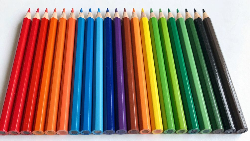
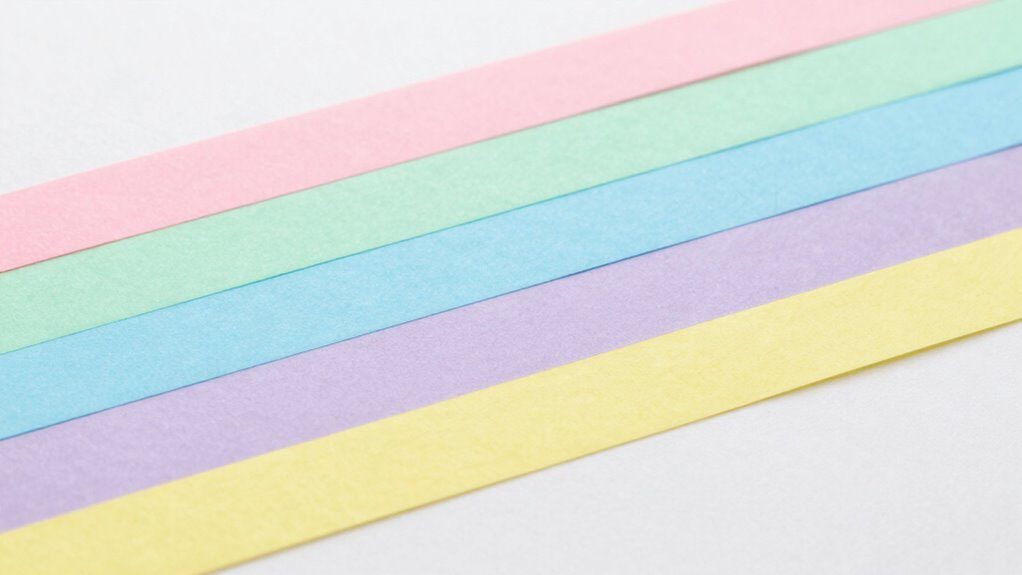
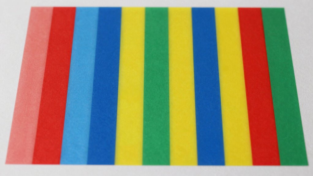
Organizing and lining up multiple colors effectively begins with sorting your items by hue. Understanding color theory helps you choose complementary or analogous shades that align well. Next, arrange your colors in a logical order, such as from lightest to darkest or by hue progression. This approach aligns with color management principles that improve overall accuracy. When preparing for printing, consider your printing techniques—digital, offset, or screen printing—since each impacts how colors should be organized. Use consistent spacing and clear markers to keep colors aligned during the process. Keep your workspace tidy to prevent accidental shifts. Taking these steps ensures your colors are organized and lined up precisely, making the registration process easier and more accurate. This organized approach saves time and reduces frustration during multi-color projects.
How Visual Aids and Markers Can Help You Achieve Precise Alignment
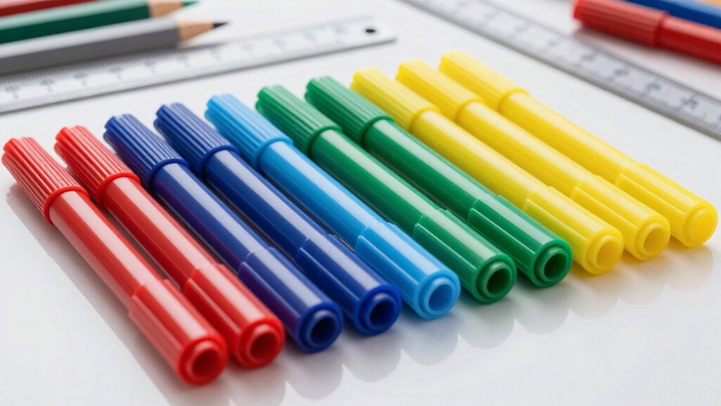
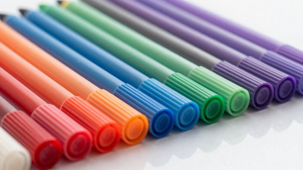
Using visual aids and markers can considerably improve your ability to align multiple colors with precision. They provide clear reference points, making it easier to achieve accurate registration. Effective marker techniques include using fine-tip pens for detailed lines or contrasting colors that stand out against your materials. Visual aids like grids, crosshairs, or numbered tabs help you stay organized and consistent throughout the process.
- Use contrasting marker colors for better visibility
- Draw light guidelines first, then refine with darker marks
- Employ rulers or stencils for straight, even lines
- Mark key alignment points clearly before layering
- Regularly check your progress with visual aids to ensure accuracy
These tools and techniques simplify complex alignments, saving you time and frustration.
Common Mistakes in Color Registration and How to Avoid Them
One common mistake in color registration is rushing through the process without double-checking alignment points, which can lead to misregistration and uneven layers. When you neglect to verify your setup, color bleeding can occur, causing colors to spill over the intended areas. This often results from registration skew, where layers don’t align perfectly due to slight shifts in positioning. To avoid these issues, take your time to carefully line up each color, using registration marks or visual aids. Ensure your printing or layering equipment is stabilized and calibrated regularly. Small adjustments can prevent costly mistakes later. Remember, precise alignment isn’t just about initial setup; consistent checks during the process help maintain perfect registration and prevent common pitfalls like skew and bleeding. Additionally, understanding layer registration and how it impacts overall quality can make a significant difference in achieving professional results. Proper calibration and accurate setup are essential to maintain alignment throughout production. Incorporating advanced registration techniques can further enhance accuracy and reduce errors during multi-color printing. Paying attention to registration consistency throughout the process can help avoid frustrating rework and ensure a smooth workflow. Recognizing the importance of visual aids can also assist in maintaining alignment during complex layering tasks.
How to Automate Your Color Alignment Process With Software
Ever wondered how to streamline the tedious process of achieving perfect color registration? Software automation simplifies aligning multiple colors by leveraging principles of color theory and advanced printing techniques. These tools analyze your designs, detect misalignments, and automatically adjust layers for precise registration. To get started, consider:
Streamline color registration with automation, leveraging color theory for precise, efficient printing results.
- Utilizing color management software compatible with your printing setup
- Setting up color profiles based on your printing techniques
- Using automated alignment features that detect registration marks
- Incorporating real-time previews to catch issues early
- Regularly updating your software to improve accuracy and compatibility
- Understanding color consistency to maintain uniform hues across your prints
- Employing advanced calibration methods to fine-tune your printers for optimal registration
Automation reduces manual adjustments and minimizes errors, making registration faster and more reliable. By integrating software that understands color theory, you ensure consistent hues across your prints while optimizing your workflow’s efficiency.
Troubleshooting: Fixing Color Mismatches When Things Go Wrong
When color mismatches occur during printing, they can disrupt your project’s quality and consistency. Common issues include color bleeding, where inks overlap and blur edges, and contrast issues, making colors appear dull or washed out. To fix these problems, start by checking your registration settings and ensuring your paper or substrate is properly aligned. If you notice color bleeding, reduce ink density or adjust drying times to prevent inks from spreading. For contrast issues, verify that your color profiles and calibration are accurate. Running test prints helps identify specific problems before full production. Regular maintenance of your printer, including cleaning print heads and checking for ink flow problems, can prevent these issues from recurring. Proper registration is essential for ensuring sharp, consistent colors and alignment in your printed materials. Additionally, using color management tools can help maintain color accuracy across different devices and media. Implementing these techniques can minimize color mismatches and improve overall print quality. Quick adjustments and thorough troubleshooting keep your colors sharp and registration spot-on.
Maintaining Your Color System for Smooth Future Registrations
To guarantee your colors stay consistent and registration remains accurate over time, you need to establish a routine maintenance plan for your color system. Regular checks help preserve color consistency and ensure your palette harmony stays intact. Keep your color codes up-to-date and review your palette periodically to catch any discrepancies early. Organize your color samples and labels for quick reference, and document any changes made to your system. Consistently calibrate your equipment to maintain accurate color reproduction. Additionally, stay informed about updates or new color standards relevant to your needs. By implementing these practices, you’ll keep your color system reliable, making future registrations seamless and preserving the visual integrity of your project.
Frequently Asked Questions
Can Color Registration Be Automated for Large-Scale Printing Projects?
Yes, you can automate color registration for large-scale printing projects. Modern printers and software guarantee color consistency by precisely aligning multiple colors, reducing manual adjustments. Automated registration helps prevent ink bleed and maintains sharp, vibrant images across extensive runs. By using advanced color management tools, you streamline the process, minimize errors, and save time, making large-scale printing more efficient and ensuring high-quality results every time.
How Do Environmental Factors Affect Color Alignment Accuracy?
Environmental influence markedly impacts color alignment accuracy, affecting your ability to maintain color consistency. Factors like temperature fluctuations, humidity, and dust can cause materials to expand, contract, or shift, leading to misregistration. To guarantee precise color alignment, you should control your workspace environment by maintaining stable conditions and minimizing environmental variations. This proactive approach helps you achieve consistent, high-quality prints with accurate color registration across multiple layers.
What Are Cost-Effective Methods for Beginner Color Registration?
To achieve cost-effective color registration, you should focus on simple registration techniques like using registration marks or guides. Practice precise color matching by carefully aligning colors before printing. You can also use inexpensive tools like transparent overlays or print test sheets to check alignment. These methods help beginners improve accuracy without investing heavily, ensuring consistent results while learning essential registration skills.
How Often Should Color Registration Tools Be Calibrated?
Think of your color registration tools as the compass guiding your creative journey. You should calibrate your tools regularly—every few weeks or after significant use—to maintain registration accuracy. This routine ensures your colors stay aligned like dancers in perfect harmony. Proper color calibration prevents blurring and misregistration, keeping your projects crisp and vibrant. Consistent calibration is the secret to smooth, professional results, giving your work that polished, flawless finish every time.
Are There Industry Standards for Perfect Color Registration?
Yes, there are industry standards for perfect color registration, though they vary by application. You should focus on regular color calibration to maintain accurate colors, ensuring your equipment aligns properly. Consistent ink flow and ink consistency are essential, so monitor and adjust your presses regularly. Following these standards helps achieve sharp, vibrant prints with minimal misregistration, making your process more efficient and professional.
Conclusion
With patience and the right techniques, you’ll master color registration like a seasoned painter blending hues on a canvas. Think of it as orchestrating a symphony, where each color plays its part in harmony. By avoiding common pitfalls and leveraging the tools and tips shared, you’ll guarantee your projects come together seamlessly—no tears, just vibrant, perfectly aligned colors that stand out with clarity and grace.