
To mix neutrals without turning muddy, focus on creating gentle contrast using warm and cool tones thoughtfully. Layer textures like matte walls with silky accessories to add depth and make shades stand out. Pay attention to undertones, ensuring they are harmonious to keep the palette balanced. Lighting also plays a key role in maintaining vibrancy and clarity. If you keep these ideas in mind, you’ll find it easier to achieve a sophisticated, well-layered neutral space. Keep exploring to learn more tips.
Key Takeaways
- Use gentle contrast by pairing warm and cool neutrals to define each shade without creating muddiness.
- Incorporate varied textures, like matte and glossy finishes, to add depth and prevent flatness in similar tones.
- Select neutrals with harmonious undertones to maintain a cohesive, layered look.
- Adjust lighting to enhance contrast and texture, ensuring neutrals stay vibrant and clear.
- Balance contrast, texture, and undertones thoughtfully for a polished, sophisticated neutral palette.
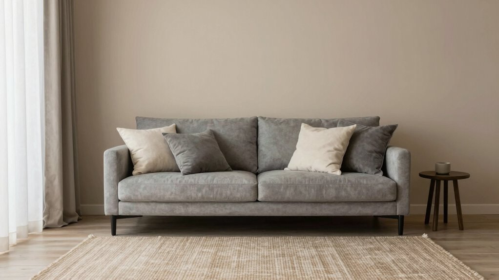
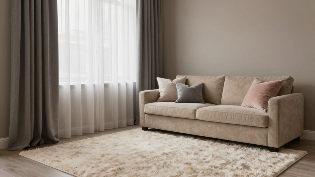
Mixing neutrals can create a sophisticated, timeless look in your space, but it’s easy for these shades to turn muddy if not done carefully. To keep your palette crisp and visually appealing, you need to pay close attention to color contrast. When blending neutral tones like beige, gray, taupe, and cream, contrast helps each shade stand out without blending into a dull, indistinct mass. For example, pairing a warm taupe with a cooler gray introduces subtle contrast that defines each color, preventing everything from merging into one indistinct hue. You want some variation in tone, ensuring the neutrals complement rather than compete. This contrast doesn’t have to be stark; it can be a gentle shift in hue or saturation that adds depth and interest to the space.
Balancing neutral tones with subtle contrast creates a timeless, sophisticated space that feels both cohesive and inviting.
Texture layering is another essential tool when mixing neutrals. It adds richness and dimension, making your interior more dynamic and less monotonous. Think about incorporating different materials—like plush fabrics, matte finishes, glossy surfaces, or textured wall coverings. When you layer these textures, even similar shades can appear distinct and layered, creating a sense of depth. For instance, combining a matte taupe wall with a silky throw pillow in a slightly different neutral instantly elevates the look, making it more sophisticated and inviting. Texture helps your neutrals breathe and prevents them from feeling flat or muddy, especially when the shades are close in tone. Additionally, understanding undertones can help you select neutrals that harmonize seamlessly and avoid muddying the overall palette.
You also want to be mindful of the undertones in your neutrals. Warm undertones tend to pair beautifully with other warm shades, while cool undertones work best with cooler hues. Mixing shades with opposing undertones can muddy the look, so choose neutrals that harmonize with each other. When done correctly, the contrast in undertones combined with varied textures creates a layered, balanced aesthetic.
Finally, consider your lighting. Natural and artificial light influence how neutrals appear in your space. Bright light can emphasize contrast and texture, making each element pop. Conversely, softer lighting creates a more subdued, cohesive look. Adjusting your lighting helps you see how your chosen neutrals interact throughout the day, ensuring your carefully layered contrasts and textures stay vibrant and clear, not muddled.
In essence, maintaining a well-balanced mix of neutrals hinges on thoughtful contrast, deliberate texture layering, and awareness of undertones and lighting. With these elements in harmony, your space will look polished, layered, and intentionally designed—never muddy or dull.
EVOLVE Interior Paint & Primer, Eggshell (Natural Beige), 1 Gallon – One-Coat Coverage, Excellent Hide, Low VOC, Low Odor, Washable Paint for Walls, Doors & Trim
- Paint and Primer in One: Provides coverage and surface sealing
- Multiple Sheens and Colors: Available in various finishes and shades
- Eggshell Finish: Soft, velvety glow with durability
As an affiliate, we earn on qualifying purchases.
As an affiliate, we earn on qualifying purchases.
Frequently Asked Questions
Can Neutrals Be Mixed With Bright Colors Effectively?
Yes, you can mix neutrals with bright colors effectively by focusing on color harmony and contrast balancing. Use neutrals as a grounding base to highlight the vibrant hues, preventing the colors from clashing or turning muddy. Incorporate neutral shades like beige, gray, or white in small doses around the bright colors. This approach creates a balanced, visually appealing space where both neutrals and bright colors complement each other beautifully.
What Tools Are Best for Blending Neutral Tones?
To blend neutral tones effectively, you should use tools like soft brushes and blending sponges, which help create smooth gradations. Incorporate texture contrast through layering techniques, adding subtle variations in tone and depth. Use a dry brush or stippling brush for delicate blending, ensuring neutrals don’t turn muddy. These tools help you achieve a balanced, cohesive look while maintaining visual interest and clarity in your design.
How Do Lighting Conditions Affect Neutral Color Mixing?
Lighting effects and color temperature greatly influence how neutrals appear. For instance, in a room lit with warm, yellow-toned lights, neutrals may seem richer and warmer, while cool, blue-toned lighting can make them appear dull or muddy. You should consider the lighting conditions when mixing neutrals, as warm lighting enhances warm neutrals, and cool lighting emphasizes cooler shades, helping you achieve the desired balance without muddying the colors.
Are There Seasonal Considerations When Combining Neutrals?
Yes, seasonal considerations matter when combining neutrals. You’ll want to adapt your palette to reflect seasonal changes, incorporating warmer tones in fall and winter, and cooler or lighter neutrals in spring and summer. Using natural textures like linen, wool, or wood enhances this effect, creating a harmonious look that feels appropriate for each season. This approach keeps your neutral combinations fresh, inviting, and seasonally appropriate without becoming muddy or dull.
Can Neutrals Be Used as a Primary Color Scheme?
You can definitely use neutrals as a primary color scheme; many find neutral color psychology calming and versatile. To avoid a bland look, incorporate neutral palette examples like taupe, beige, and soft gray with varying textures and subtle accent colors. This approach creates depth and interest while maintaining a cohesive, sophisticated vibe. Neutrals serve as a strong foundation, allowing your decor’s personality to shine through without overwhelming the senses.
Conclusion
To keep neutrals fresh, keep balance, keep contrast, and keep confidence. Mix light and dark shades, warm and cool tones, and different textures to create depth without muddiness. Avoid overloading on similar hues; instead, introduce subtle variations to keep your palette lively. Remember, it’s all about intentionality—know when to blend, when to highlight, and when to stand back. Follow these steps, and your neutrals will always look sophisticated, never muddy.