
TL;DR

Get business pricing on tools and workshop supplies
- Business-only prices and quantity discounts
- Tax-exempt purchasing
- Multiple users, one account, clear invoices
House Beautiful published designers’ recommendations for six paint colors that can make a room feel more vintage: Wedgwood blue, butter yellow, oxblood, warm parchment, pale peach and midnight blue. The designers describe how these shades can suggest age and character, but the report does not establish that paint alone makes a home authentically vintage.
House Beautiful has published six designer-recommended paint colors for homeowners seeking a vintage-inspired look: Wedgwood blue, butter yellow, oxblood, warm parchment, pale peach and midnight blue. The report presents the shades as ways to add a sense of history and character to a room, including in newer homes, based on designers’ opinions and project examples rather than a formal study.
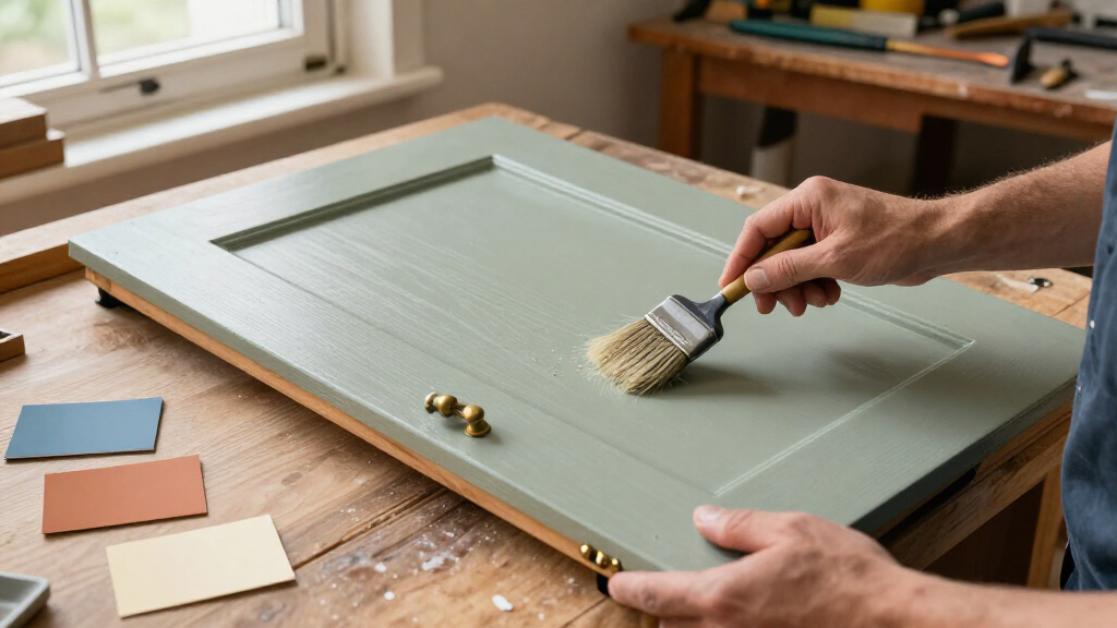
Jessica Risko Smith, an interior designer with Santa Barbara firm JRS ID, recommends Wedgwood blue, a dusty blue-gray she says shifts in appearance with changing light. Smith says the shade can recall old European farmhouses or coastal cottages. Her team used it in a kitchen renovation, where the report says it helped give new cabinetry a more established feel.
Butter yellow is the color Andrew Suvalsky, a New York City-based interior designer, associates with the 1960s. He describes it as playful and says it can work on a ceiling or in a kitchen. For a more subdued neutral, Smith recommends warm parchment: a white-family shade with yellow or blush undertones, rather than a stark, bright white. She says those undertones can soften a room’s edges and suggest a sun-faded finish.
The other three suggestions offer deeper or rosier color. Oxblood, described by Iona Graham of Graham & Brown as warm and heritage-inspired, may suit smaller rooms or accent walls. Suvalsky recommends pale peach for a balance of freshness and coziness, and midnight blue for a saturated, architectural effect. House Beautiful’s report includes examples of these shades in bedrooms, a bar and other interiors, but does not provide paint formulas or a standardized color comparison.
How Color Can Suggest a Room’s Age
For readers updating a new or builder-grade home, the recommendations offer a relatively direct way to change a room’s mood without first replacing furniture or adding accessories. The designers’ central point is that color can contribute to a sense of heritage and permanence: dusty blue-gray may read as weathered, parchment can soften a bright interior, and saturated blue or oxblood can evoke traditional rooms.
The advice is best understood as design guidance, not a guarantee. A paint color’s effect depends on light, nearby materials, furnishings and the room itself. The report gives examples and professional opinions, but it does not test whether these colors reliably make homes look older or compare them with other approaches to vintage styling.
Popular right now

Shark Rocket Ultra-Light Corded Stick Vacuum, HV301, Gray/Orange

TCL T7 Series 85-Inch 4K 144Hz QLED Smart Google TV

Vitamix Propel Series 510 Professional-Grade Blender, 3 Programs, Black
As an affiliate, we earn on qualifying purchases.
Six Shades, Different Historical References
The article frames the palette as useful both for homes with existing period features and for recently built spaces that lack them. Rather than recommending one uniform historical scheme, it groups colors with different associations: butter yellow is linked by Suvalsky to the 1960s, while the report describes pale peach as appearing in both muted midcentury interiors and brighter 1980s versions. The designers’ suggestions therefore span several styles and eras.
Other colors are presented through material and architectural associations. Wedgwood blue takes its name from the English fine china brand, according to the report, while midnight blue is described by Suvalsky as regal and architectural. Oxblood is positioned as a dramatic, cocooning option. These are the designers’ interpretations; the report does not identify a single historical period as the source for every shade.
““It reads differently in every light: almost slate in the morning, almost soft denim by afternoon.””
— Jessica Risko Smith, interior designer at JRS ID
What Paint Alone Cannot Establish
The report does not specify brand names, exact paint codes, finishes or application methods for the six colors. It also does not say how each shade will look under different lighting or alongside particular flooring, trim and furnishings beyond the examples described. Readers may need to test samples in their own rooms before choosing a color.
The word “vintage” is used as a design impression, not a verified age or style classification. The article offers designer recommendations and selected project examples; it does not claim that painting a room in one of these shades makes its furnishings, architecture or overall design historically authentic.
Test Samples in Your Own Light
For homeowners considering the palette, the practical next step is to compare paint samples in the room at different times of day and against existing finishes. The supplied report does not announce a follow-up study or further publication schedule. Any broader conclusions about which colors work best will depend on individual spaces and how readers use the designers’ suggestions.
Key Questions
Which six paint colors did the designers recommend?
The list is Wedgwood blue, butter yellow, oxblood, warm parchment, pale peach and midnight blue.
Which color did the article connect with the 1960s?
Designer Andrew Suvalsky linked butter yellow to the 1960s, while describing it as playful and relevant today.
What is warm parchment?
In the report, warm parchment is a soft white-family color with yellow or blush undertones, rather than a stark, bright white. Jessica Risko Smith says it can soften a room’s appearance.
Does one of these colors guarantee a vintage-looking room?
No. The article presents designers’ opinions and examples, not a guarantee or a formal test. The final effect can depend on lighting, furnishings, materials and the room’s architecture.
Source: housebeautiful.com