To test color palettes quickly, create small swatches or digital samples and compare them side by side. Use online tools like color wheels and palette generators to refine choices fast. Overlay colors onto wireframes or layouts to see how they work in context. Test your palette on screens, print, and in different lighting conditions to guarantee versatility. For more tips on efficient testing methods, keep exploring how you can make confident, informed decisions.
Key Takeaways
- Create quick swatches or digital samples to compare palette harmony visually.
- Overlay colors onto wireframes or layouts to see real-world application instantly.
- Use online tools like color wheels and palette generators for rapid testing.
- Evaluate colors across different screens, lighting, and print to ensure versatility.
- Gather immediate feedback from colleagues or friends to assess emotional and visual impact.

When choosing a color palette for your project, testing it quickly can save you time and prevent costly mistakes later. The key is to get a sense of how the colors work together before diving into detailed design work. You don’t need to spend hours on complex mockups—simple, fast tests can reveal a lot about palette harmony and overall effectiveness. By applying basic principles of color theory, you can evaluate whether your colors create the desired mood, contrast, and balance. Color theory helps you understand how colors interact, guaranteeing your palette evokes the right emotional response and maintains visual coherence. This foundational knowledge allows you to make informed decisions early on, rather than relying on guesswork. Additionally, understanding biodiversity can inspire more harmonious color choices that reflect natural ecosystems and promote sustainable aesthetics. Incorporating color harmony principles into your testing process can further streamline your decision-making. Palette consistency is essential when testing colors quickly. If your colors clash or feel disjointed, the entire project risks losing its professional look. To check for consistency, start by creating small swatches or digital samples that you can easily compare side by side. Use tools like color wheels or online palette generators to see how your chosen hues relate to each other. When testing, consider how your colors appear in different contexts—digital screens, printed material, or varied lighting—so you can catch inconsistencies before they become costly fixes. You can also incorporate visual perception insights to better understand how viewers interpret your palette in various environments. Understanding how colors are perceived can help you choose shades that remain effective across different viewing conditions. Recognizing the impact of lighting conditions on color appearance is crucial for ensuring your palette remains consistent in real-world settings. Consistent use of color helps reinforce branding and ensures your audience perceives your message clearly and cohesively. One effective way to test your palette rapidly is to create quick mockups or prototypes. For example, if you’re designing a website, overlay your colors onto a simple wireframe or layout. Look at how your primary, secondary, and accent colors interact in real use. Do they create enough contrast for readability? Do they evoke the right feelings? If it’s a brand, ask yourself if the palette aligns with the brand identity you want to communicate. You can also gather quick feedback from trusted colleagues or friends, observing their reactions and impressions. This immediate input can help you identify issues with palette harmony or emotional impact, saving you from later revisions. Finally, don’t forget to test your palette across different devices and lighting conditions. Colors can appear vastly different on a computer monitor versus a printed piece or a smartphone. By checking your palette in these various environments, you guarantee its versatility and consistency. Remember, rapid testing isn’t about rushing through the process; it’s about making smart, informed decisions early on. With a bit of knowledge about color theory and a focus on palette consistency, you can streamline your workflow and create compelling, harmonious color schemes in record time.

Angchun Handheld Colorimeter – Precise Portable Color Analyzer Digital Color Reader with 8mm Aperture and True -Color Display Tester Kit Lab Colorimeter Color Difference Meter Tester for Multi-Purpose
✅【Multifunctional Colorimeter】Angchun portable color analyzer widely applies to color quality control, color difference control, color difference analysis, sampling…
As an affiliate, we earn on qualifying purchases.
As an affiliate, we earn on qualifying purchases.
Frequently Asked Questions
Can I Test Color Palettes on Multiple Devices Simultaneously?
Yes, you can test color palettes on multiple devices simultaneously by ensuring proper color calibration and device synchronization. Use calibration tools or software that automatically adjust colors across devices, maintaining consistency. Cloud-based testing platforms also help you view real-time updates across screens, making it easier to see how your palette looks on different devices at once. This approach saves time and guarantees your colors stay accurate everywhere you display them.
How Do I Ensure Color Accuracy Across Different Screens?
Think of your screens as vintage radios needing tuning. To guarantee color accuracy across devices, you should perform proper color calibration and screen profiling on each. Use hardware calibration tools or software to adjust settings, matching colors precisely. Keep profiles updated regularly, especially when working with different devices or lighting conditions. This process guarantees consistent, reliable colors everywhere you view your work, much like tuning a radio to get the clearest sound.
Are There Tools That Simulate Real-World Lighting Conditions?
Yes, there are tools that simulate real-world lighting conditions to help you test color perception accurately. Lighting simulation software like Adobe Photoshop’s built-in features or specialized programs such as Capture One let you preview how colors look under different lighting scenarios. These tools enable you to adjust lighting settings, helping you see how your palette will perform in various environments, ensuring your colors remain true before finalizing your design.
How Fast Can I Get Feedback on Color Palette Choices?
Think of your design process as a race against time—feedback on your color palette can come in a flash, often within minutes. Using tools that analyze color psychology and harmony, you get instant insights, helping you see how your choices evoke emotions and work together. This quick feedback lets you tweak and perfect your palette on the fly, ensuring your final look hits the mark without delay.
Can I Share Quick Palette Tests With Clients Remotely?
Yes, you can share quick palette tests remotely with clients. Use digital tools like Figma or Adobe XD to present color options instantly. Incorporate insights on color psychology to explain your choices and consider cultural influences that might affect perception. This approach allows clients to give rapid feedback, ensuring your palette aligns with their vision while considering emotional and cultural nuances. It streamlines decision-making without sacrificing depth.

Original Bamboo Filament Swatch Kit, 80pcs 24x24mm 3D Printer Material Sample Color Card, Injection Molded PLA/PETG Physical for Color Matching&Material Selection – Random Color Distribution(1 Box)
【80 Physical Color Swatches for Accurate Material Reference】 Stop guessing colors from your monitor. This kit includes 80…
As an affiliate, we earn on qualifying purchases.
As an affiliate, we earn on qualifying purchases.
Conclusion
Now that you know how to test color palettes swiftly, you can avoid the frustration of a wrong choice—like waiting for a telegram in a world of instant messages. Just keep experimenting, gather feedback, and trust your instincts. Remember, even Picasso didn’t get it right on the first try. With these quick tests, you’ll save time and create a design that truly pops, proving that sometimes, the fastest way is also the smartest.
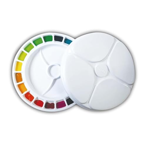
Mijello MWP-2020 20 Wells Water Color Color Wheel Palette
Mijello MWP-2020 Water Color Wheel Palette
As an affiliate, we earn on qualifying purchases.
As an affiliate, we earn on qualifying purchases.

Datacolor SCK310 SpyderCHECKR Photo Color Reference Tool
PRECISION COLOR IS THE FIRST: Pocket sized essential color reference tool for photographers or hybrid image creators
As an affiliate, we earn on qualifying purchases.
As an affiliate, we earn on qualifying purchases.